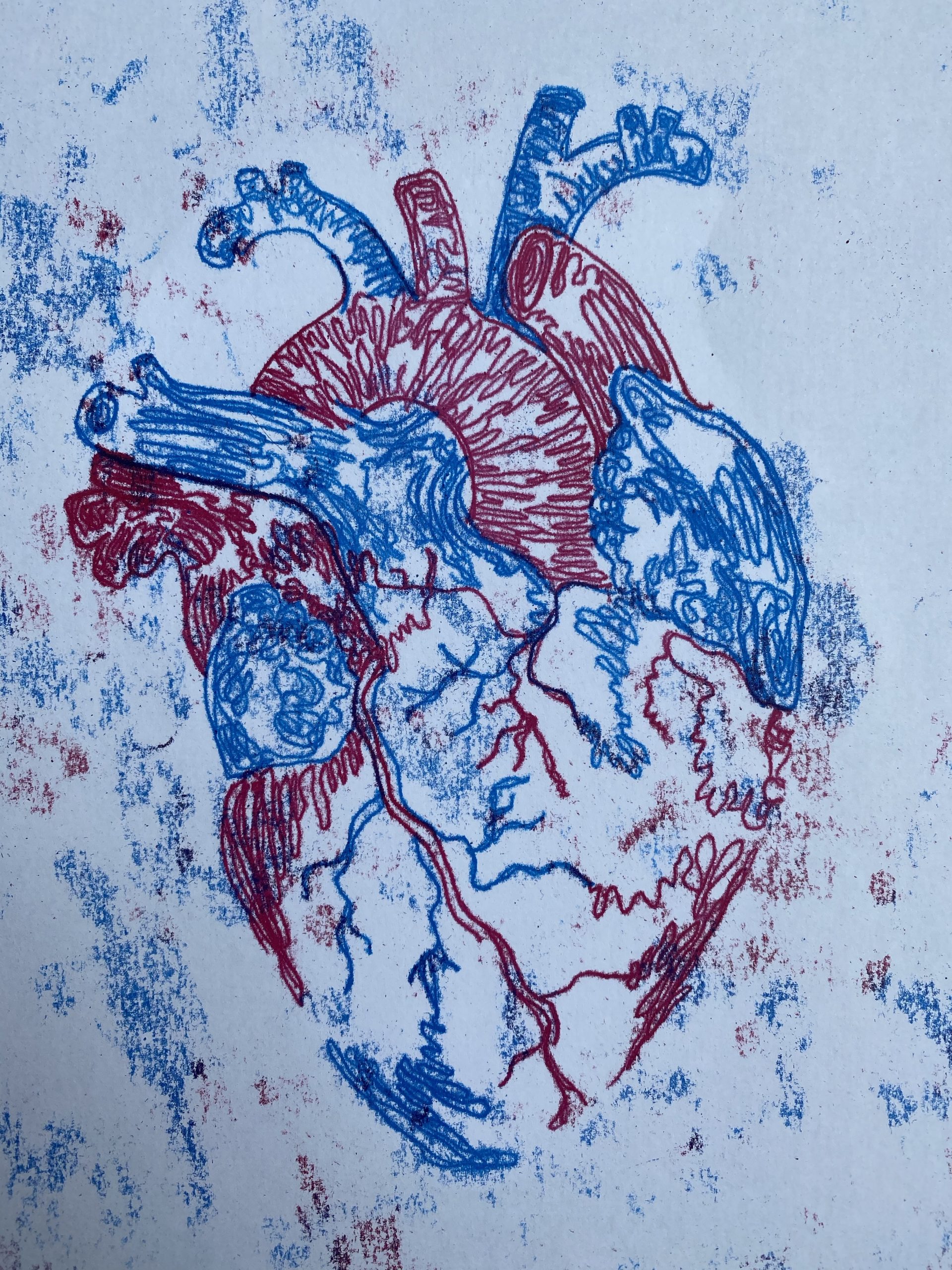
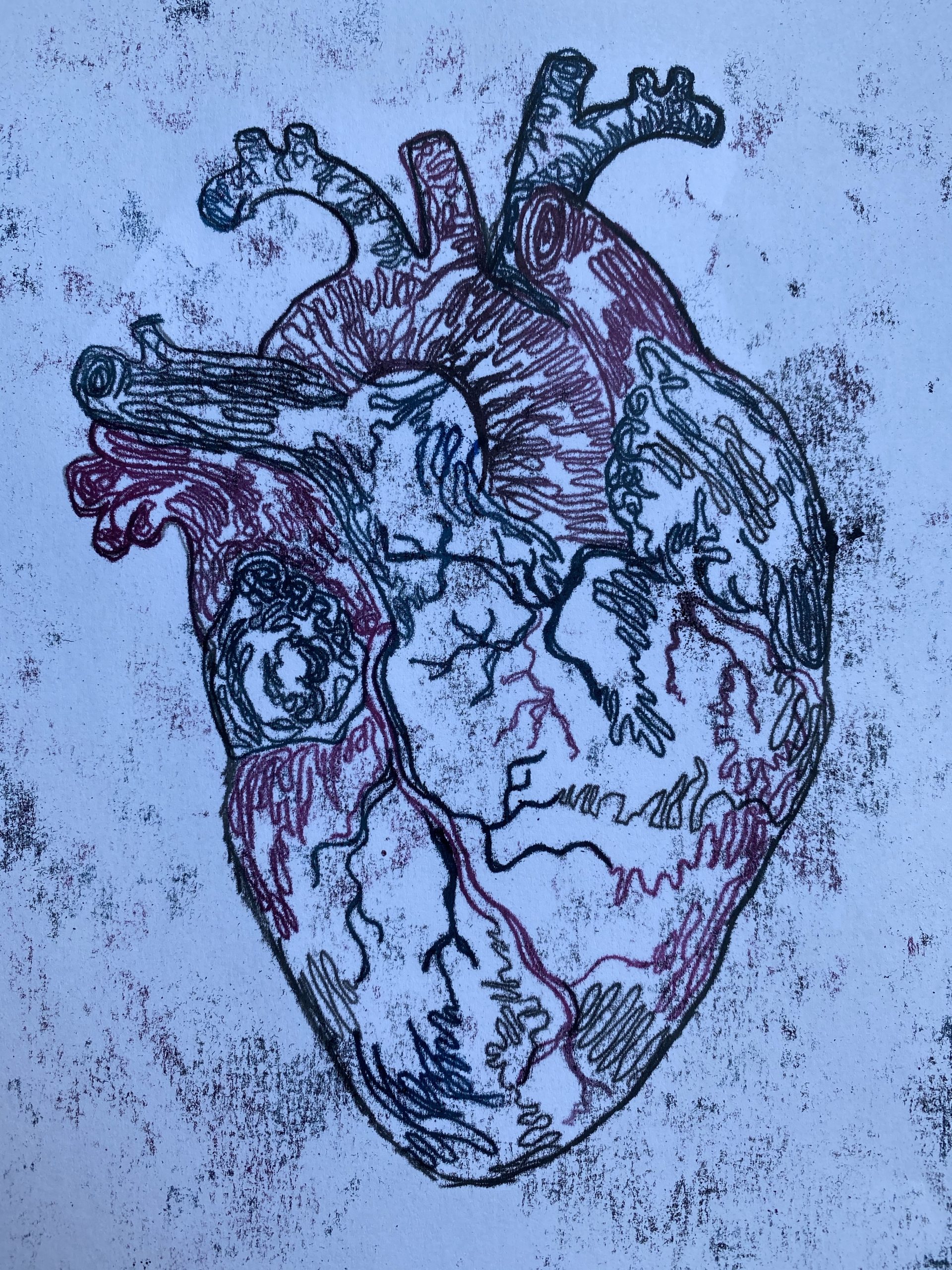
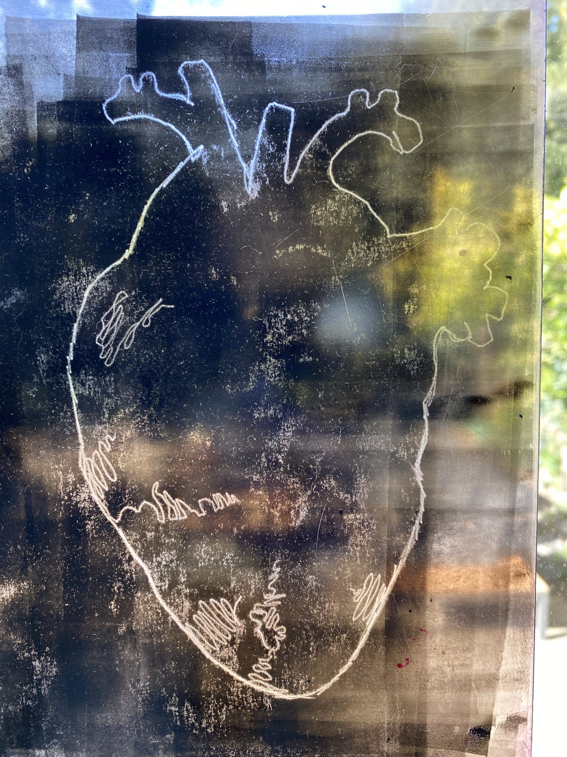
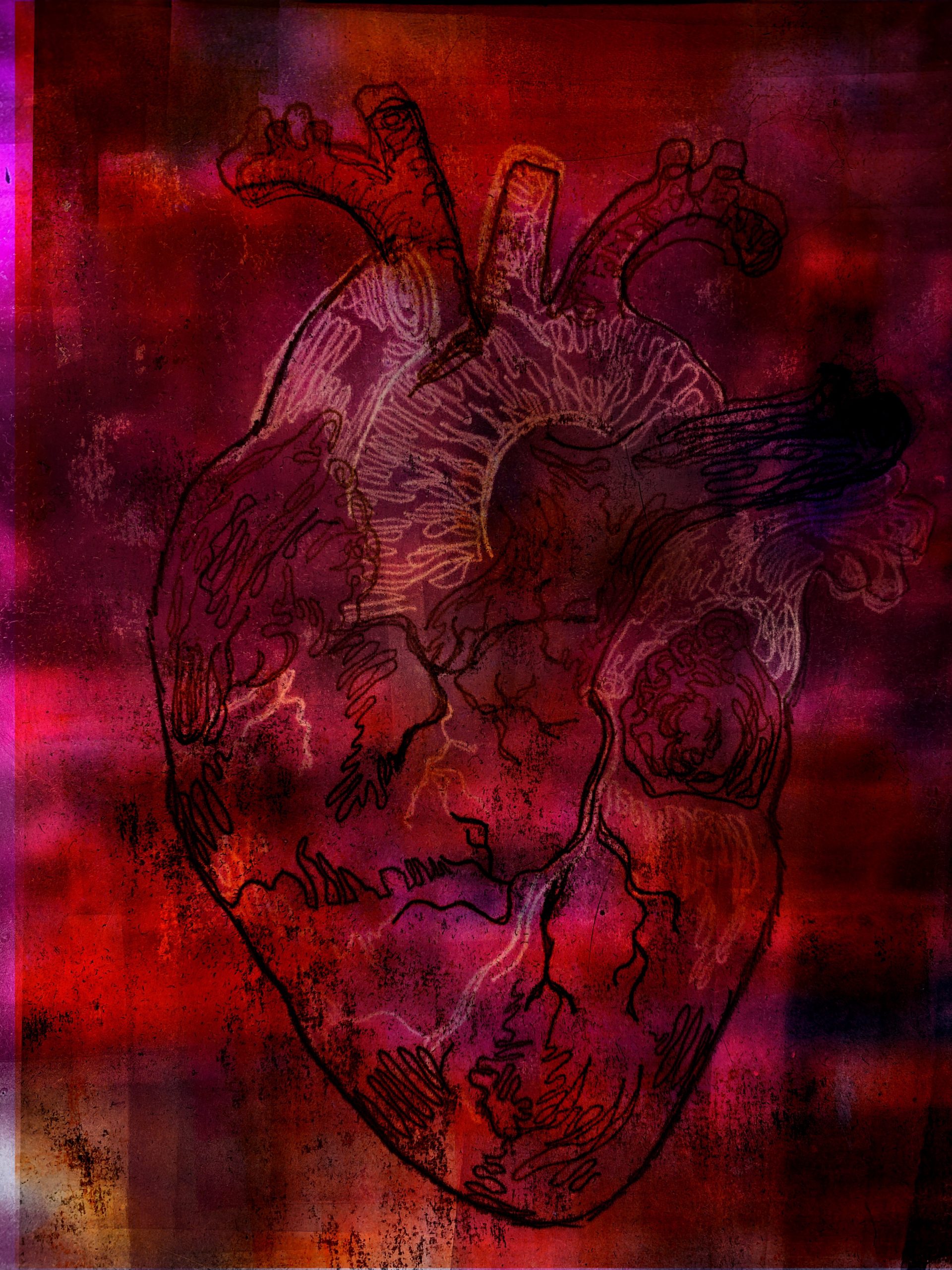
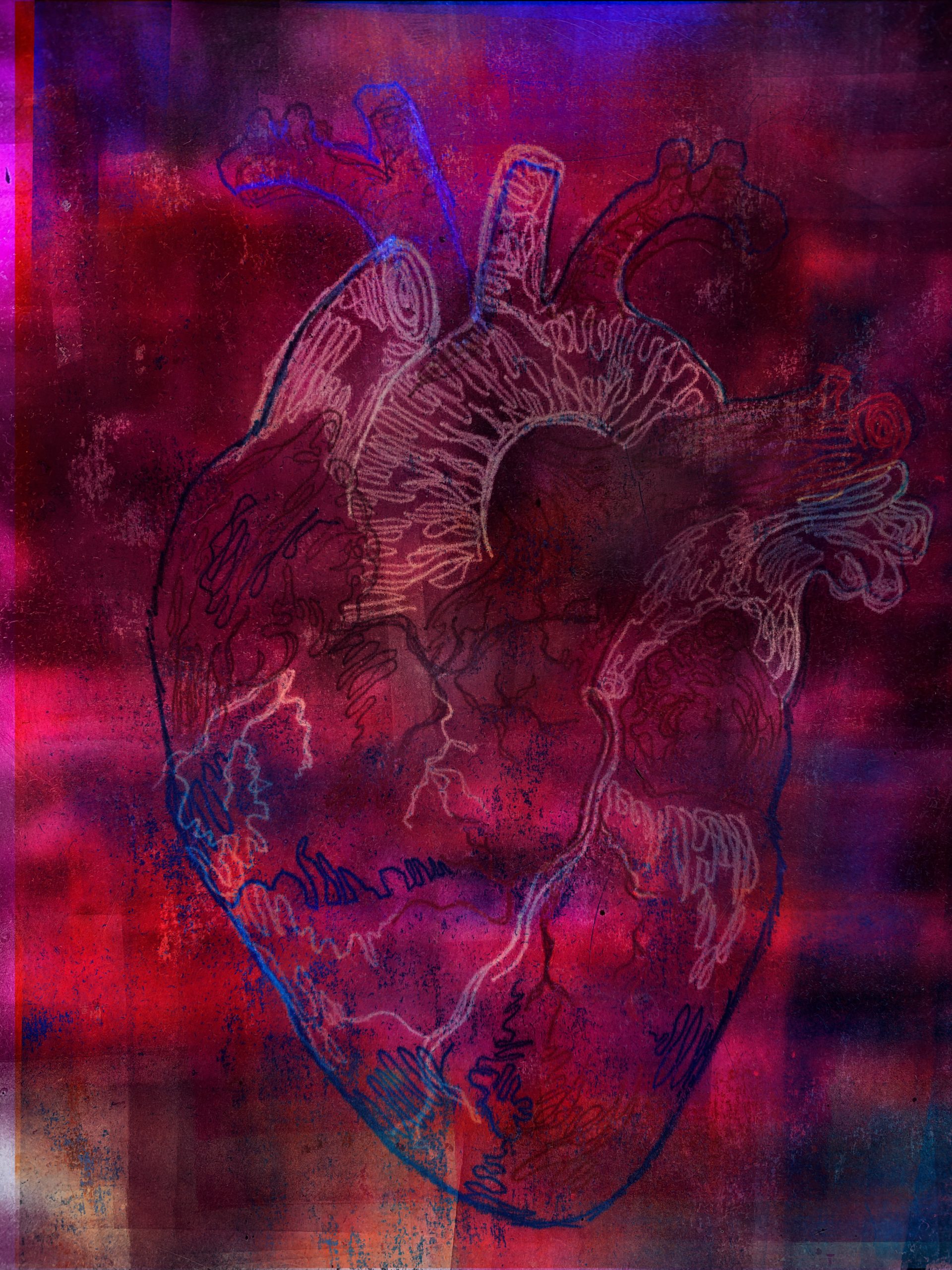
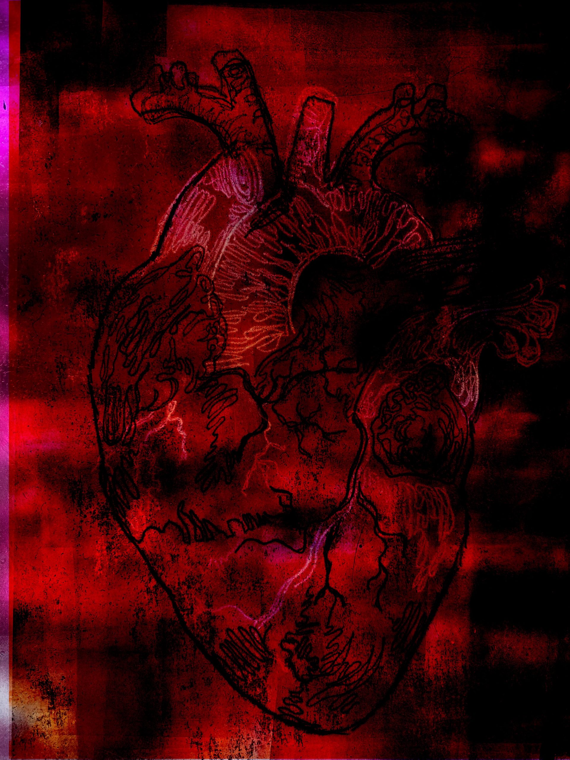
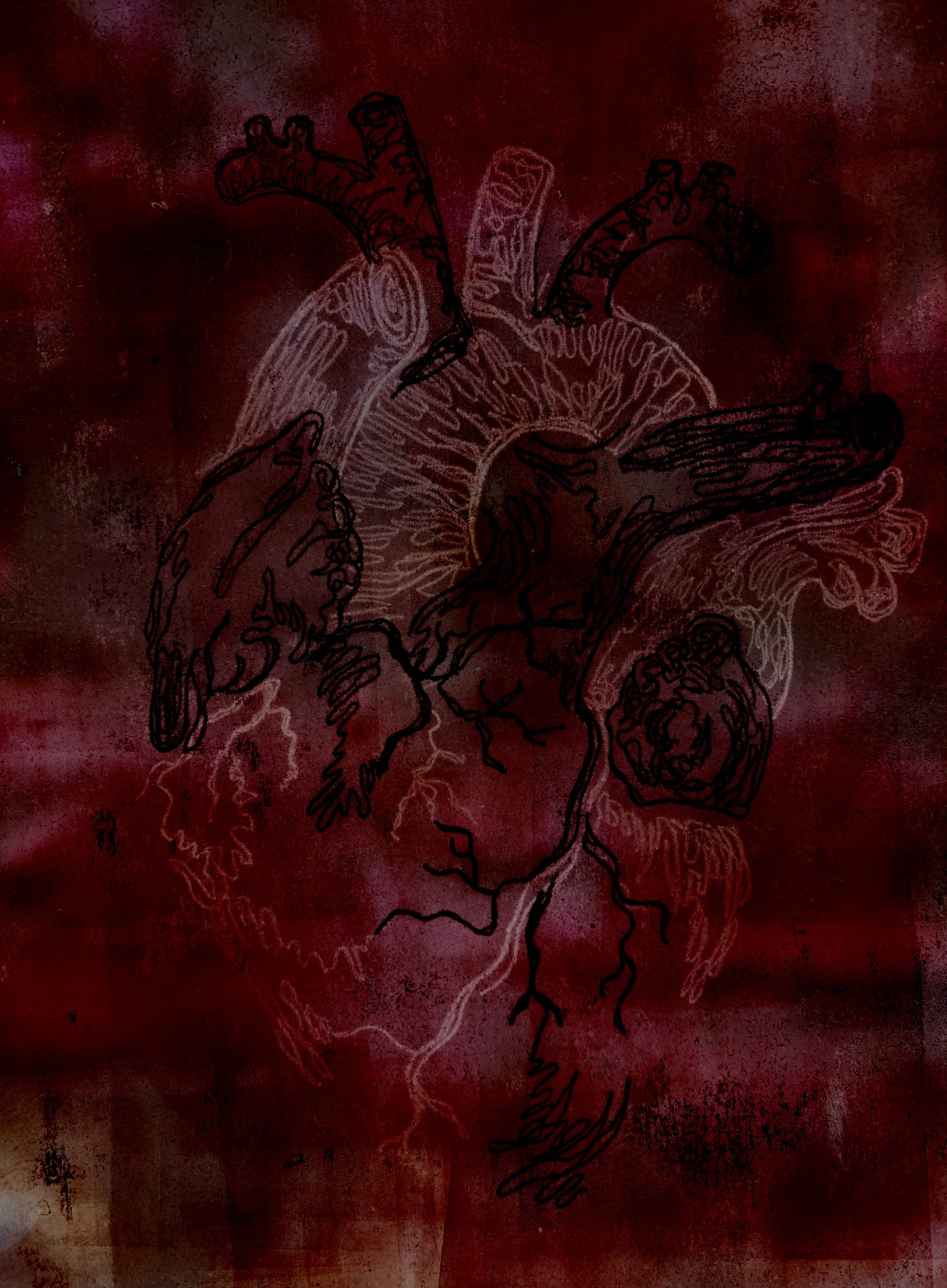
I decided to develop the heart a bit further and experiment with some new ideas I had. I decided to use different colour inks such as blue and red also using black ink to outline the heart. While doing this monoprint I decided to do it in sections, so I did all the blue parts first and so on, I did add some black to my cyan blue as it was to bright however I think I added a bit too much black. While doing each section I decided to do a continuous line where my pencil doesn’t leave the page.
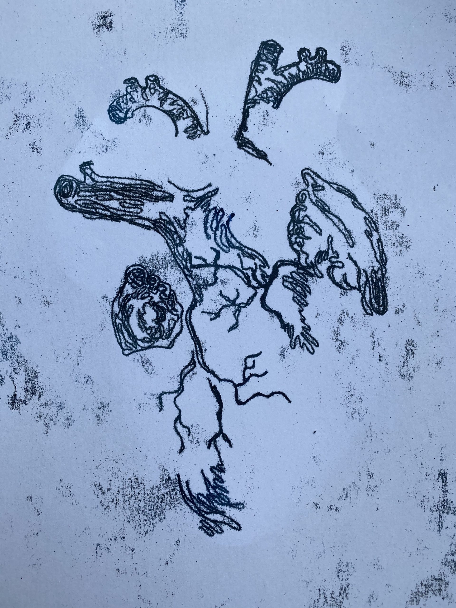
After completing each section of colour for the monoprint I decided to photograph the acrylic sheet as it left the marks/drawing I had done which I always find interesting to look at. After taking the photographs of the individual sheets I then had an idea to try and overlay, edit and develop them a bit further so that they would fit together.
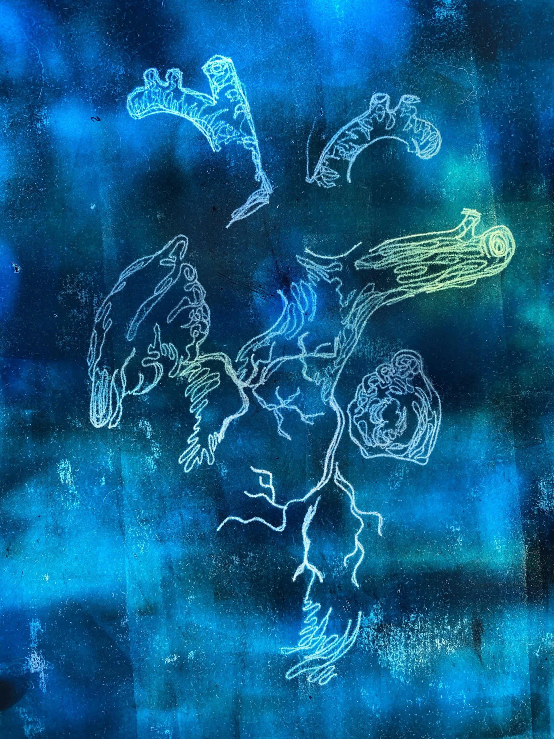
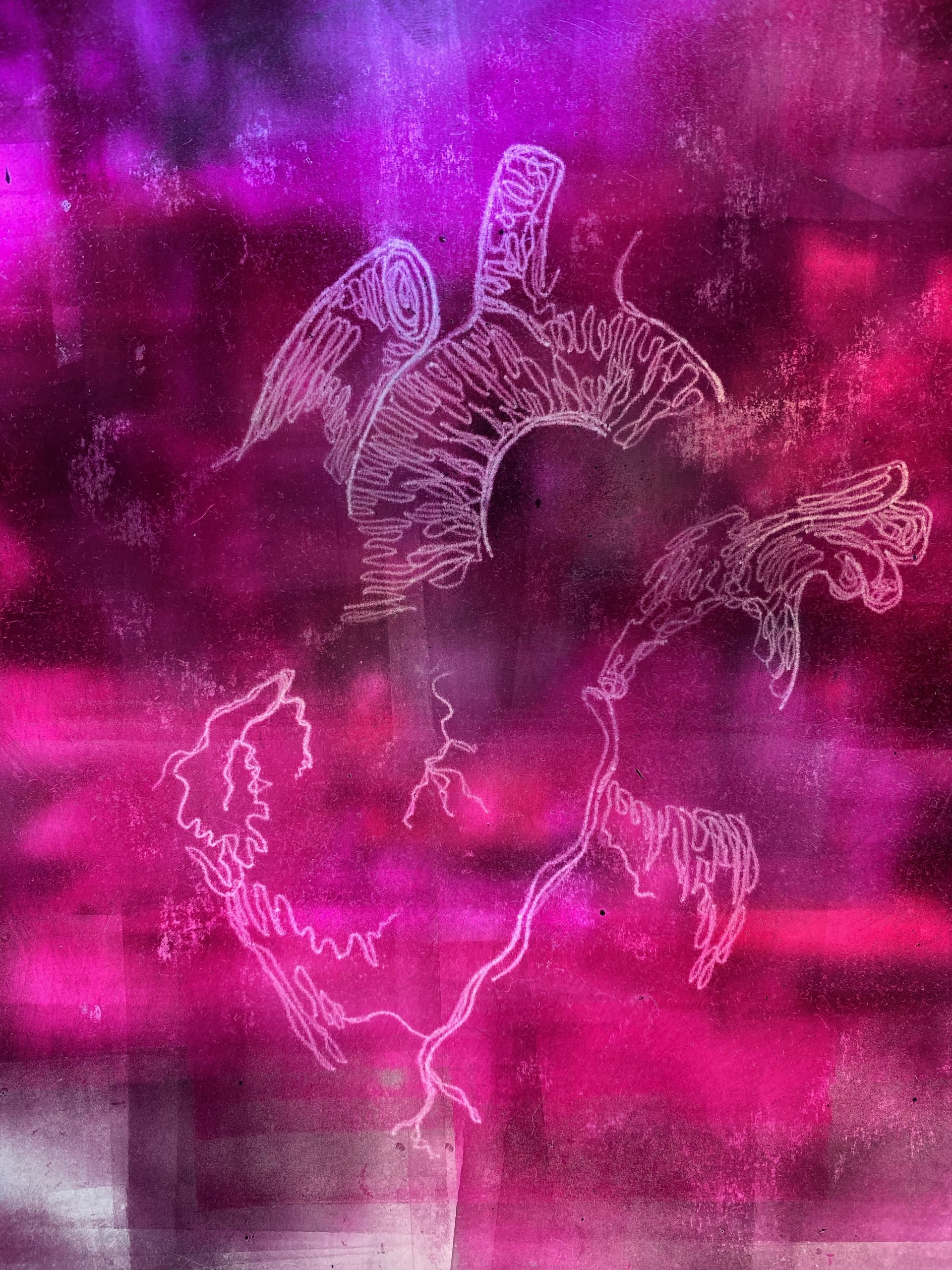
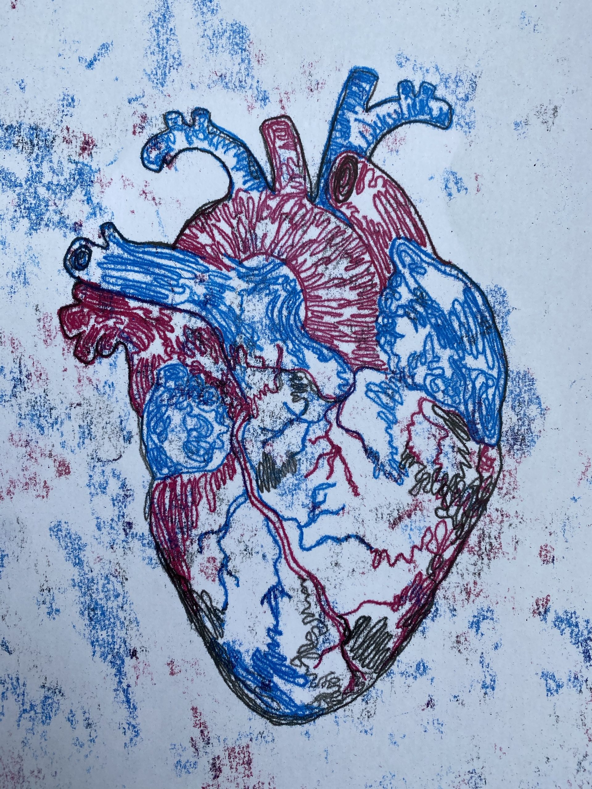
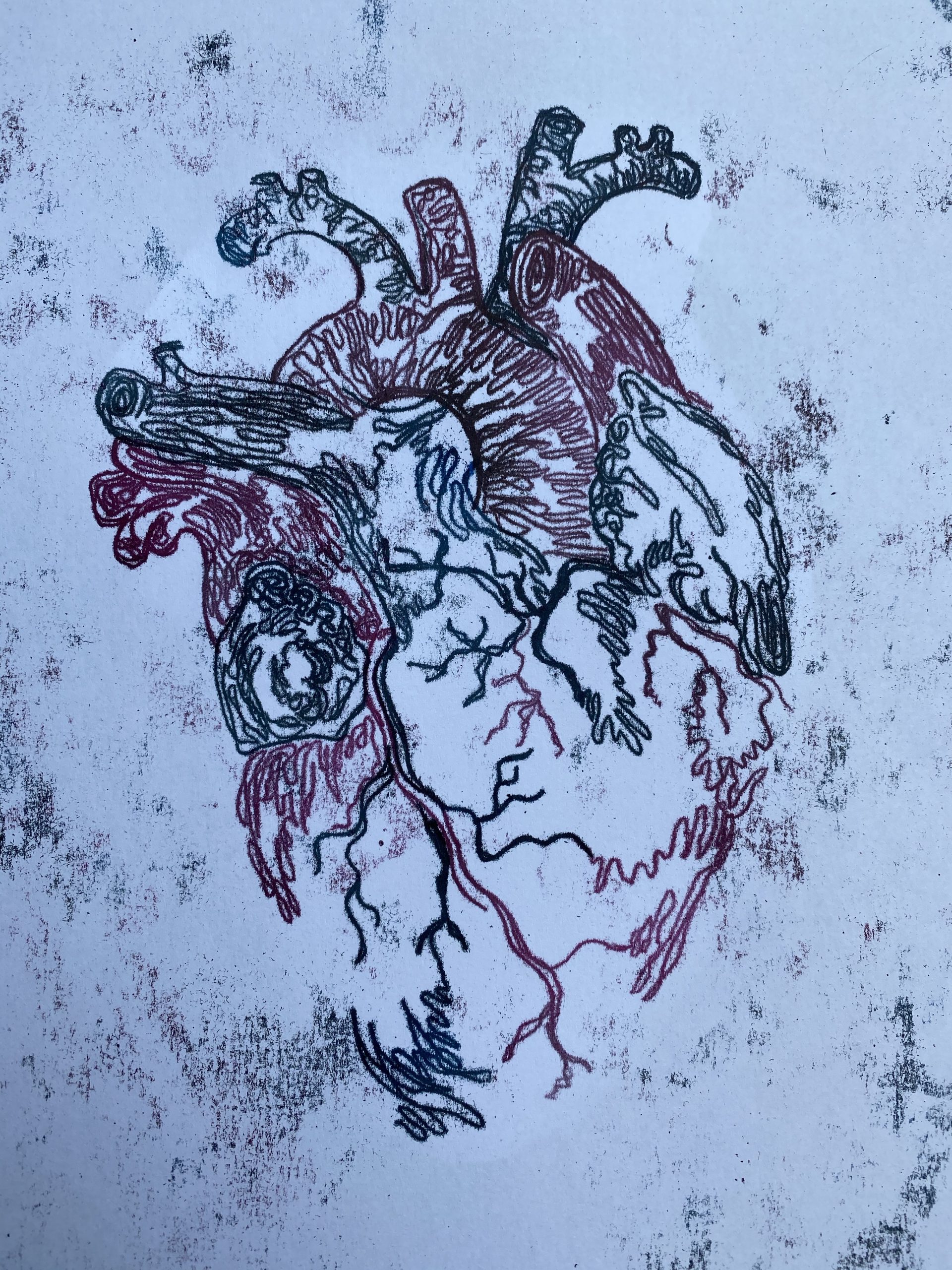
Here are the results I got after lining the images all together.
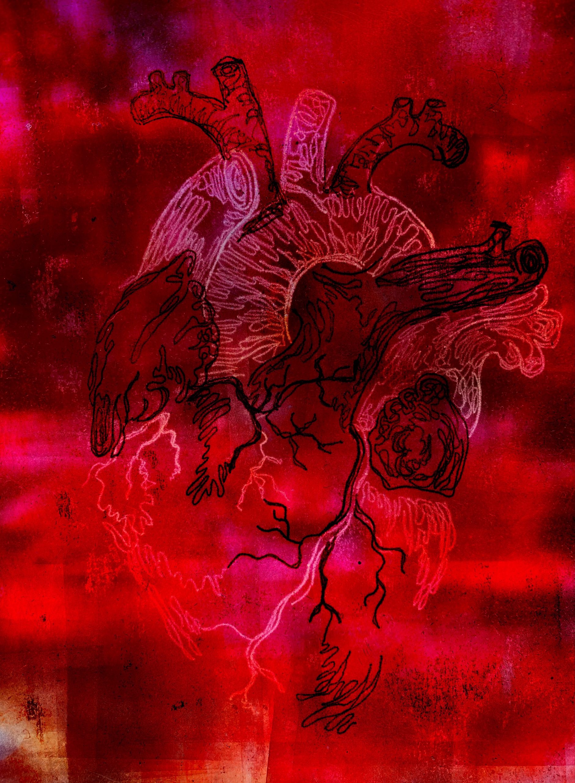
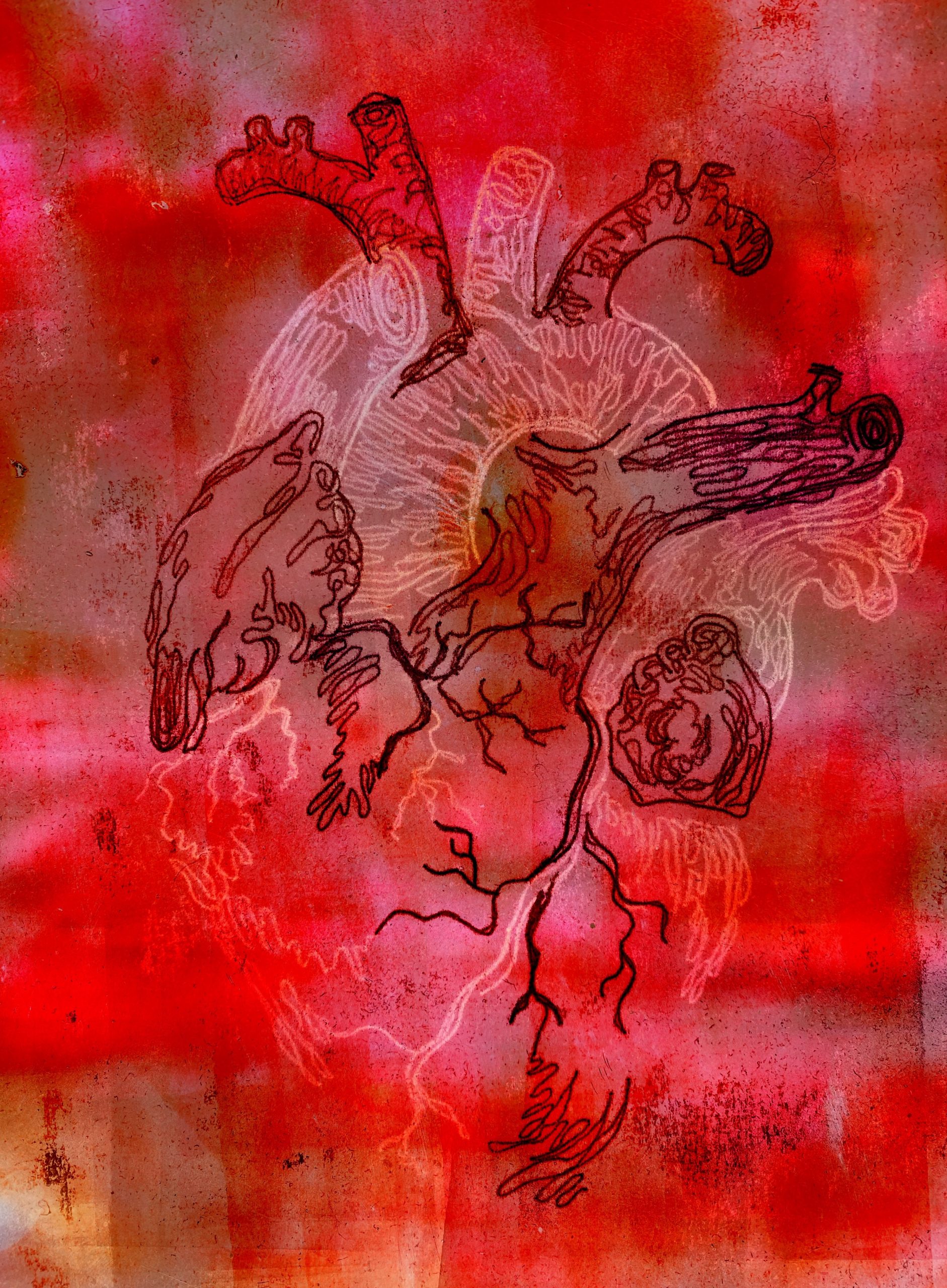
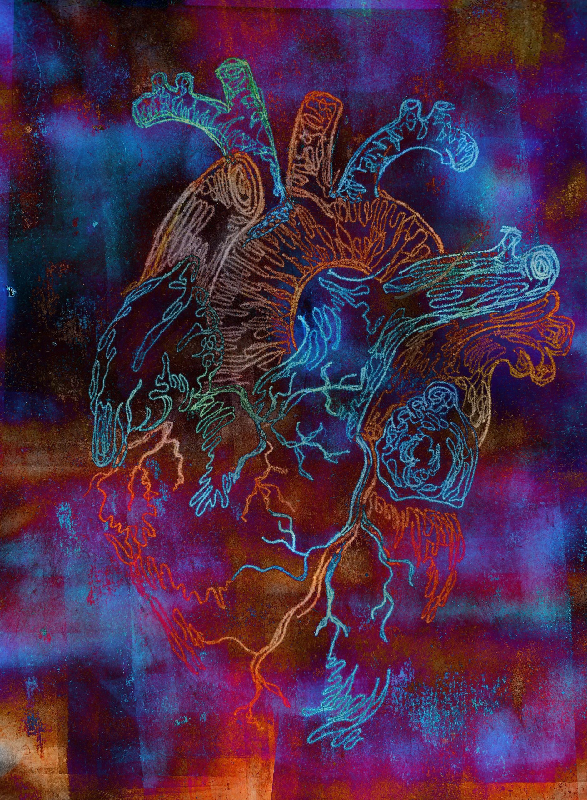
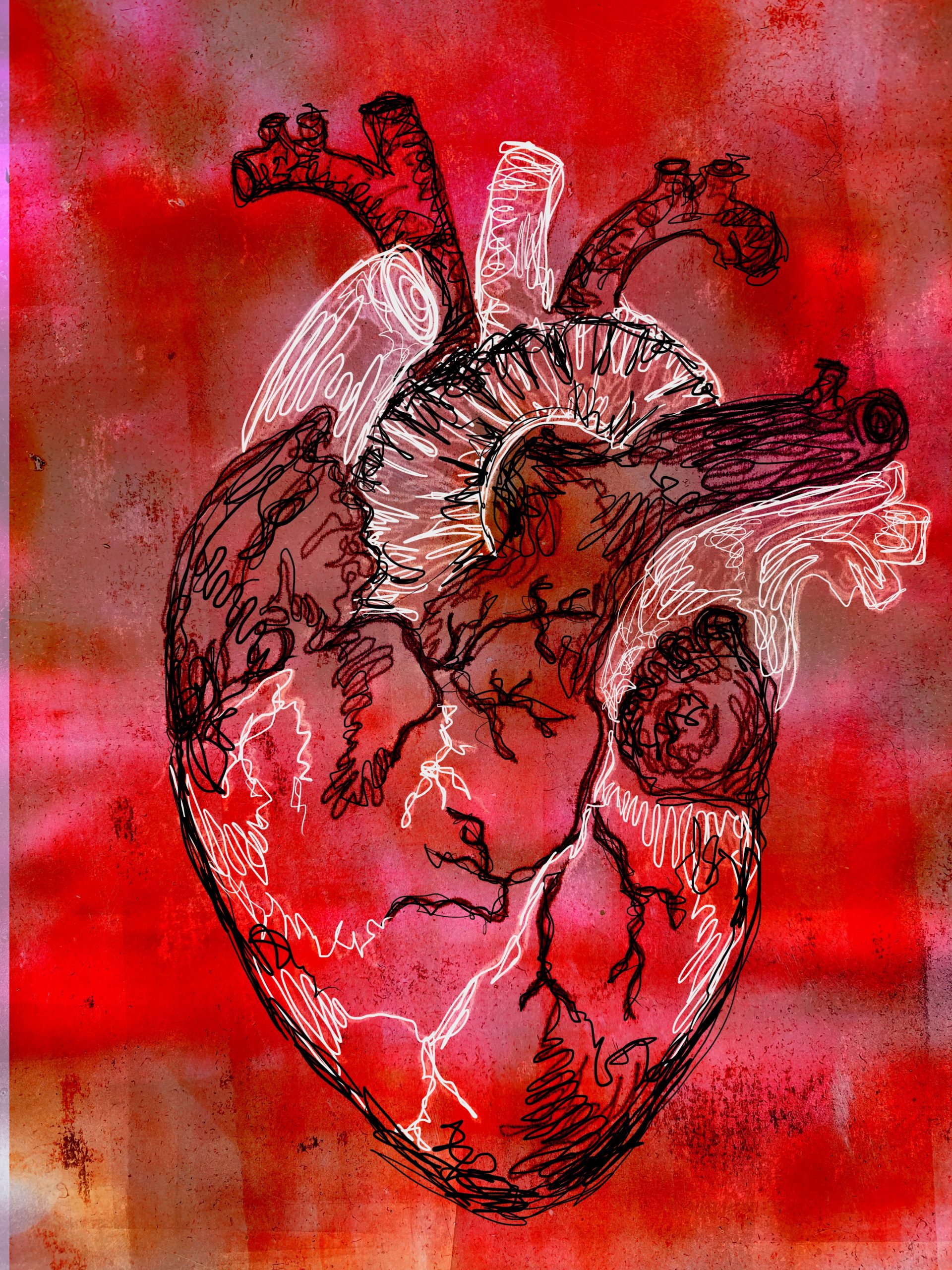
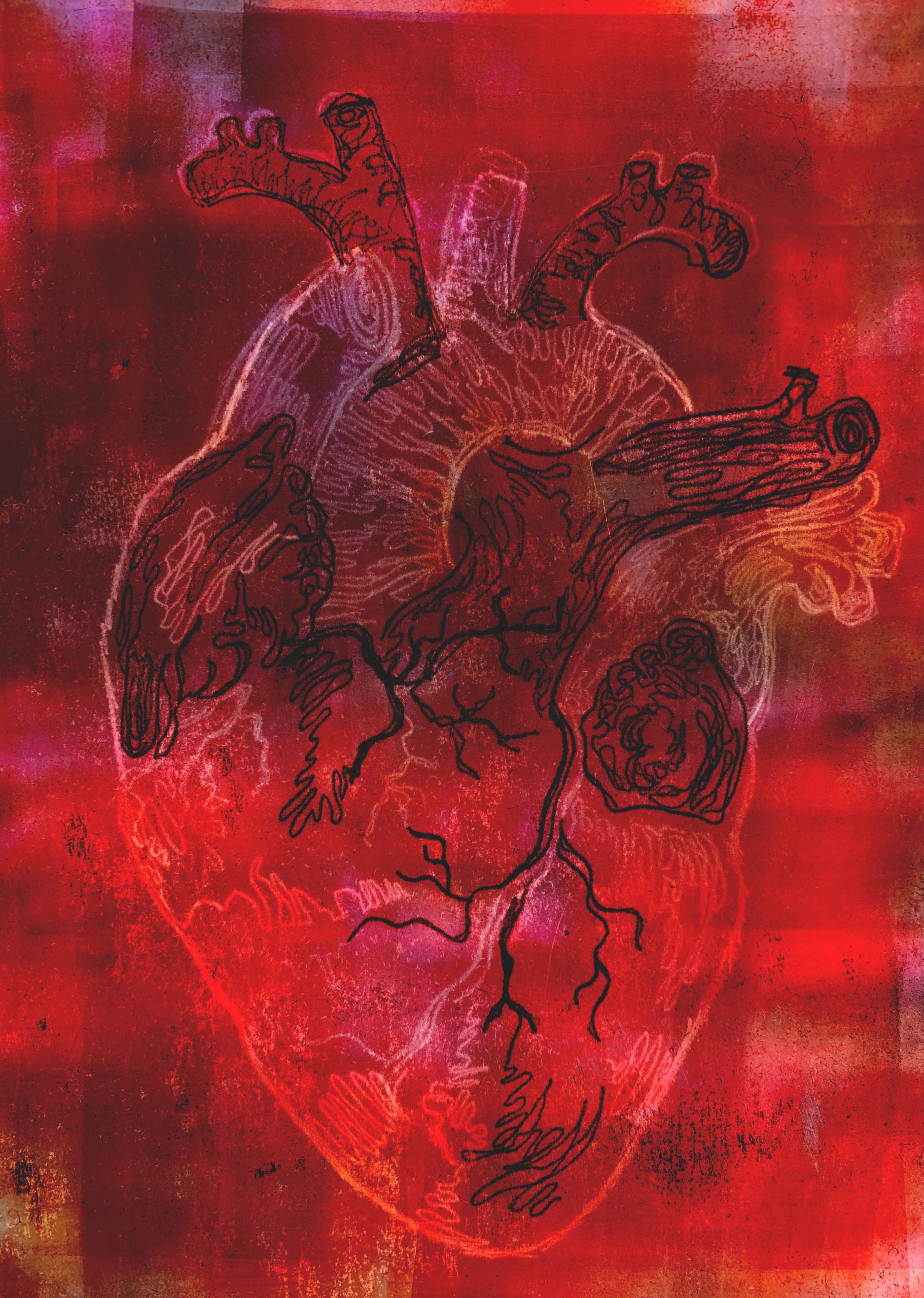
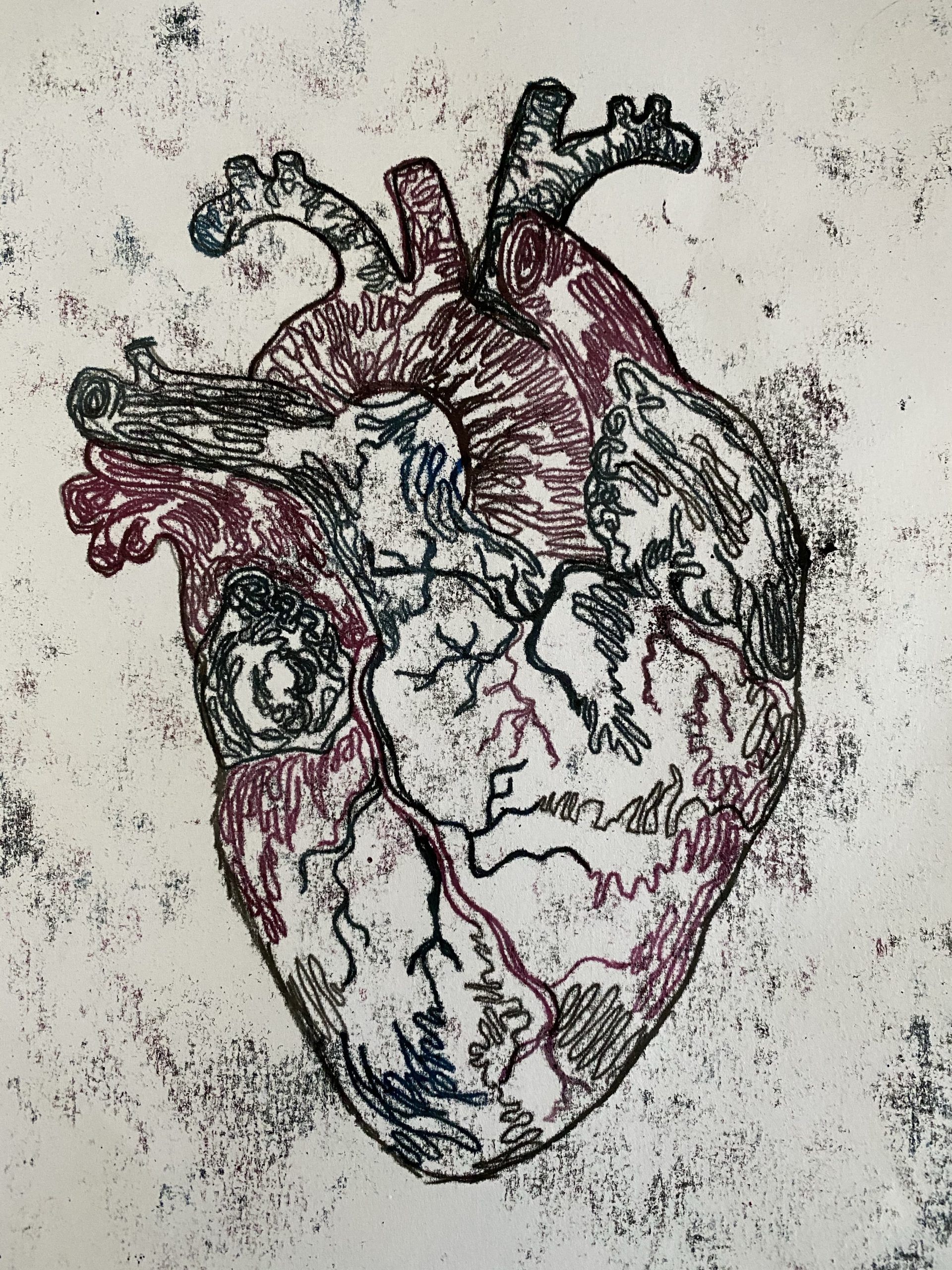
After looking at my first attempt of the heart I realised a few things had gone wrong such as adding to much black to the blue and red, so I decided to do it again but this time I did not add any black to the blue and red. I prefer this one to the first one I did as the colours are a lot brighter allowing them to stand out from the black I used to outline the heart.