Categories
Contextual Research

Leicester Contemporary Gallery.

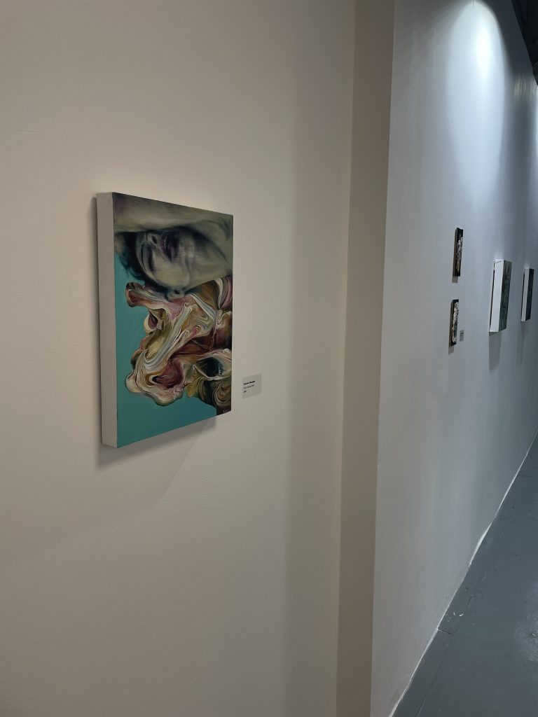
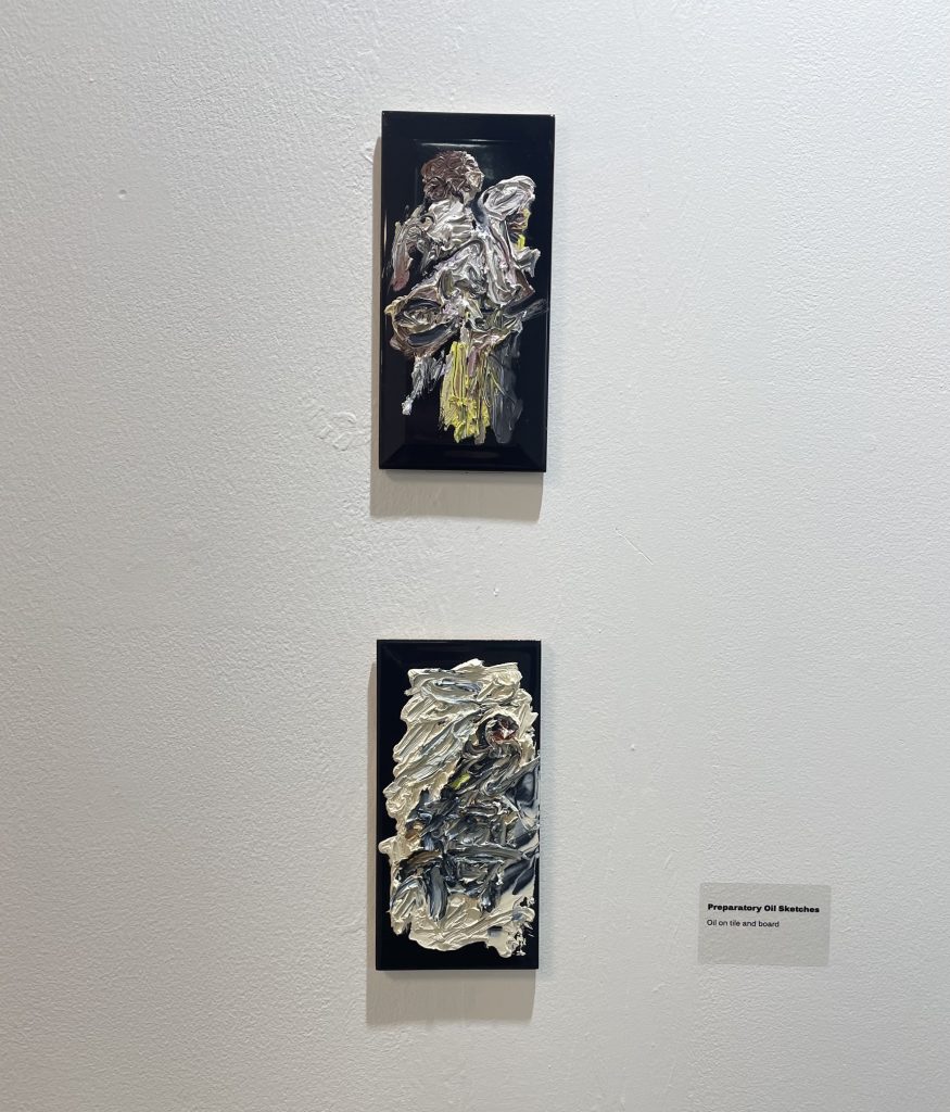
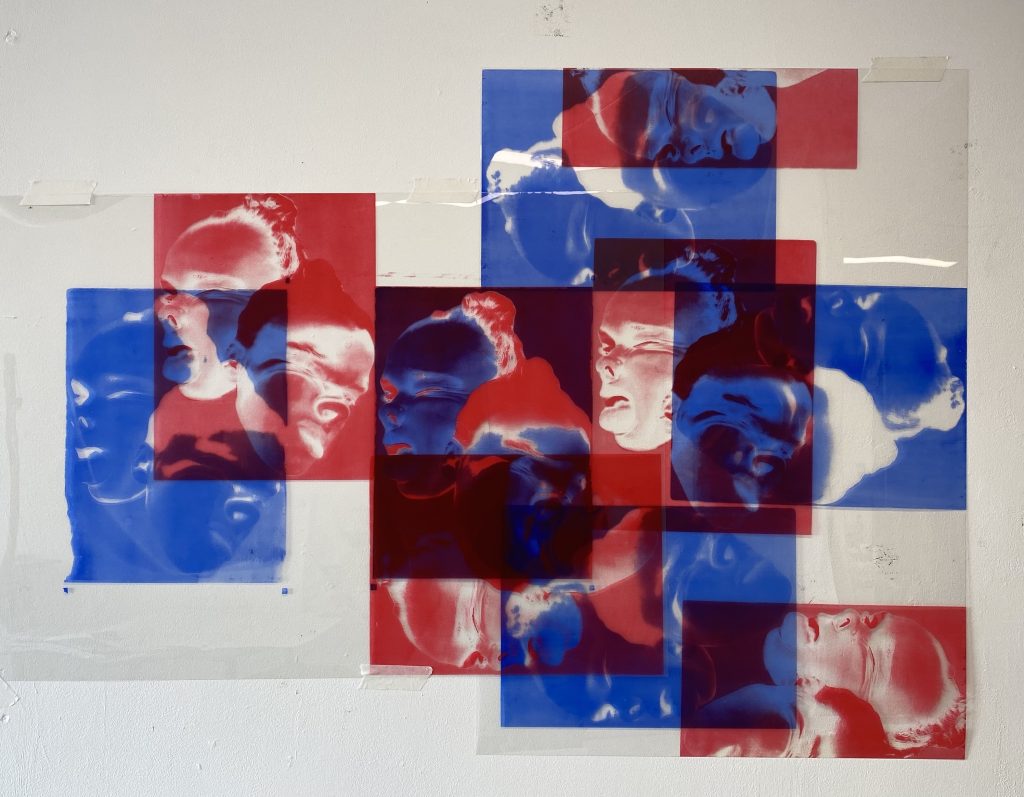
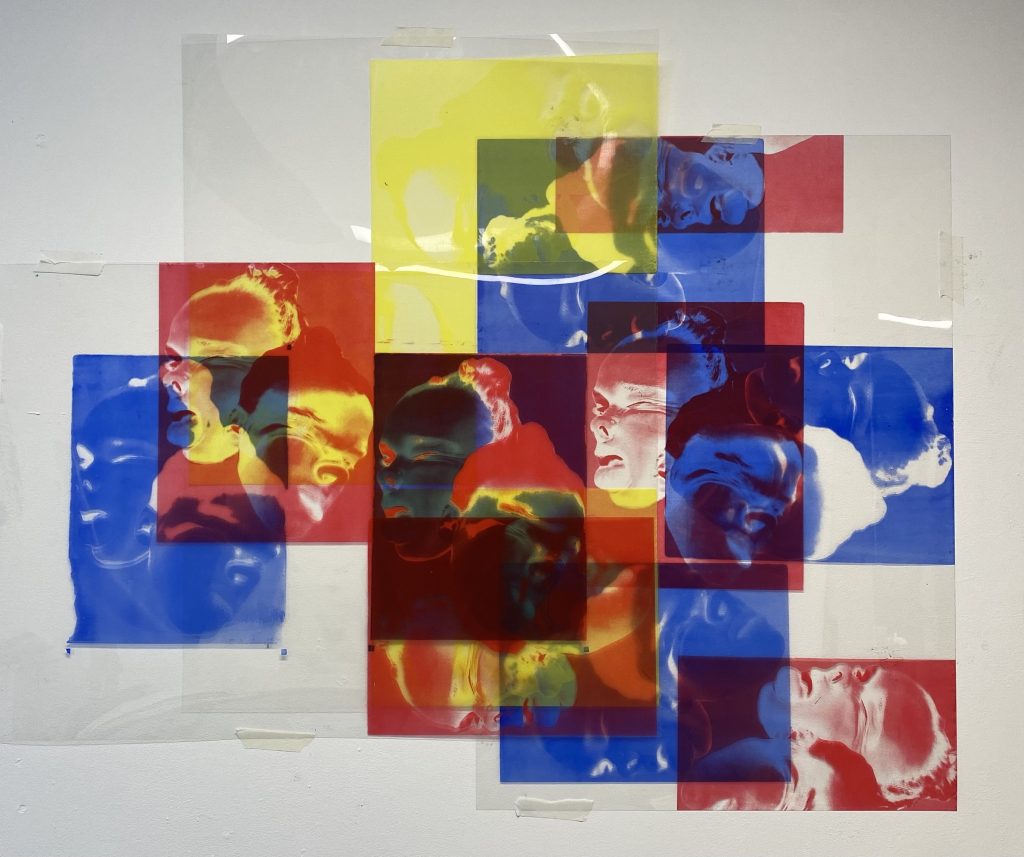
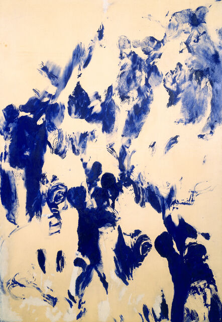
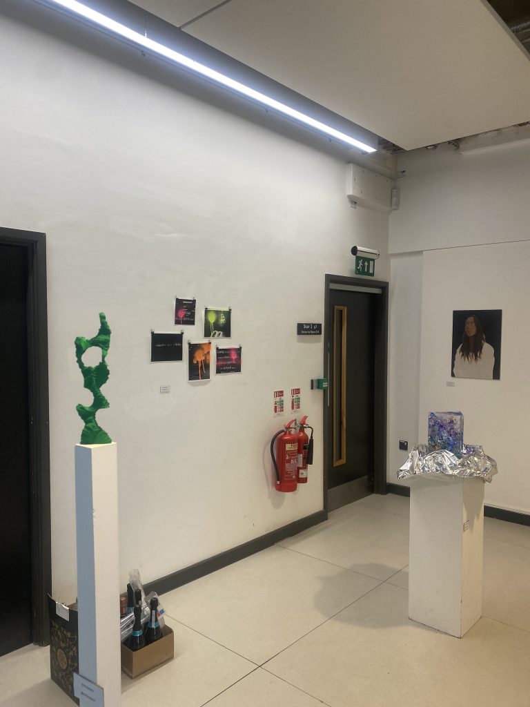
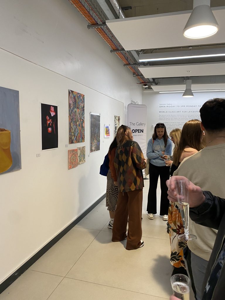
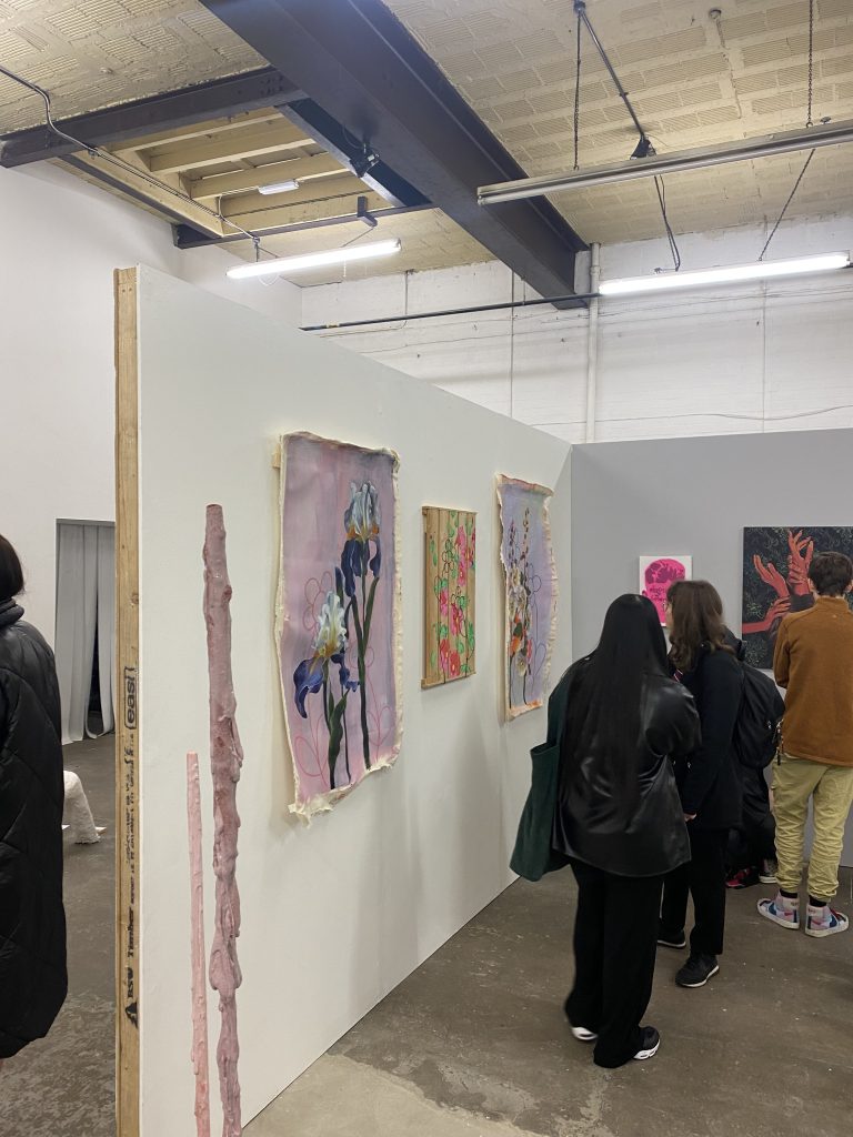
I went to go and see Andrew Birks exhibition ‘From the Past’ that took place in the Leicester contemporary gallery. Birks is very multi-media artist he practices in sculpture, print and painting being his main one. His exhibition mainly involves his paintings that he refers to “paintings of paint”. The way he creates some of his paintings is by painting onto a tile with thick paint and then taking a photograph of it or keeping the existing piece of art work and using that as a reference.

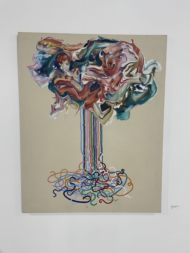
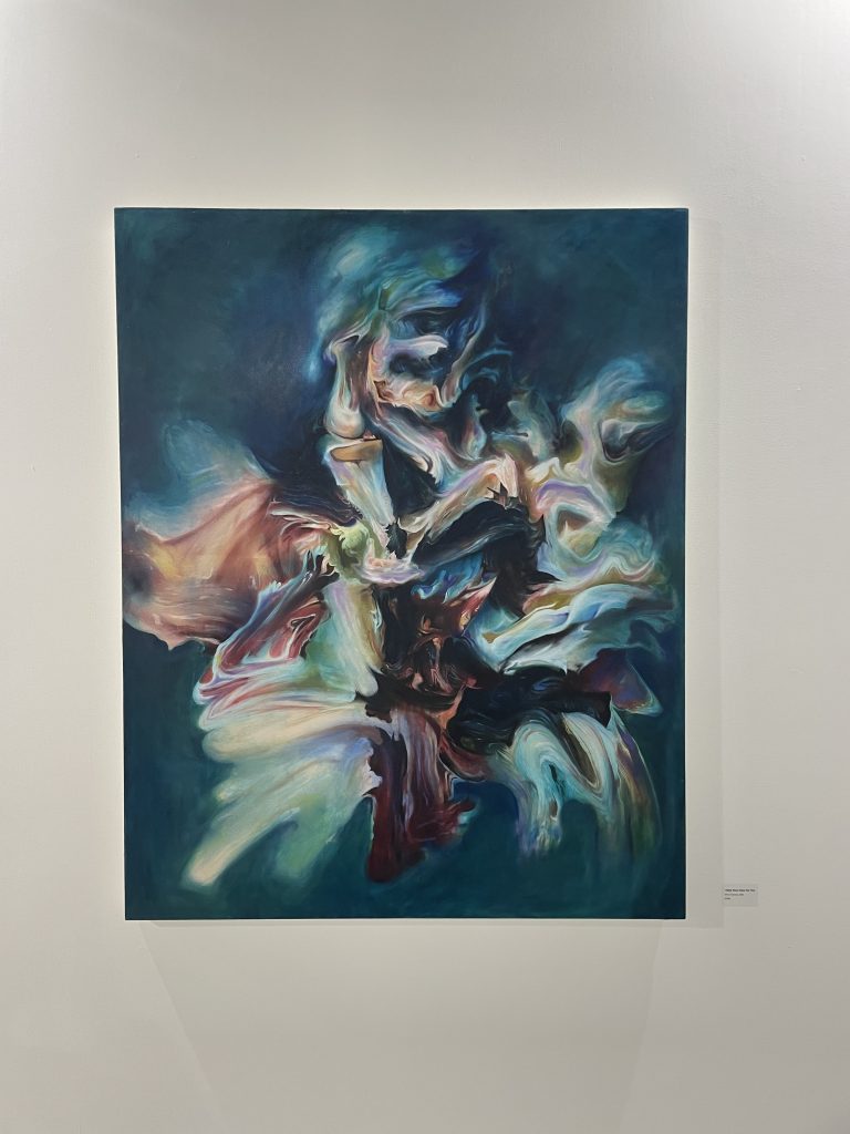
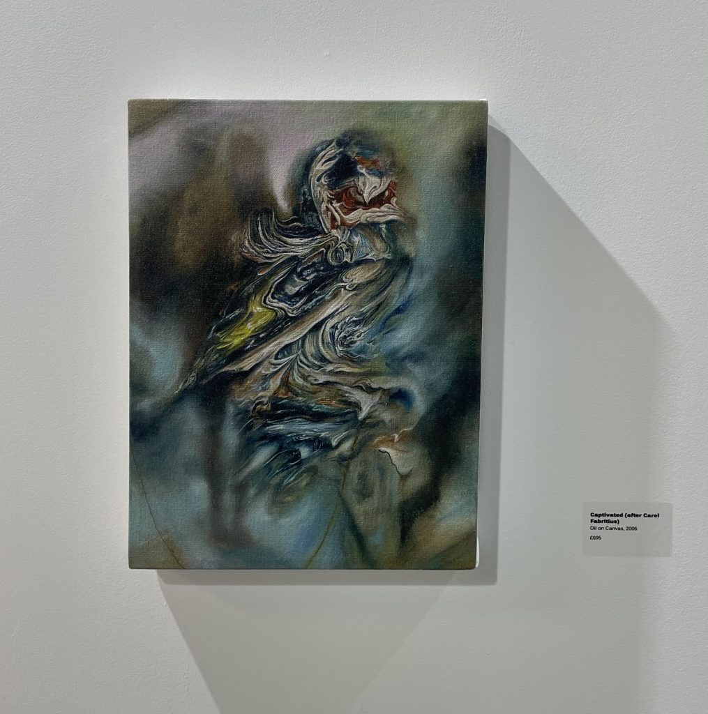
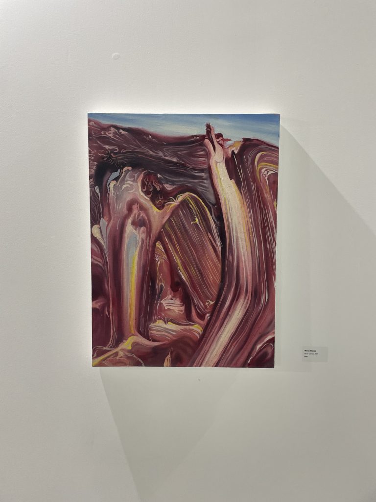
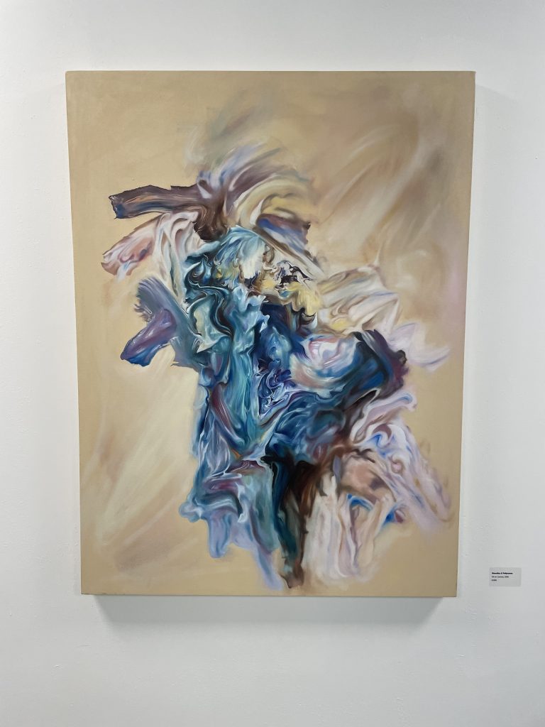
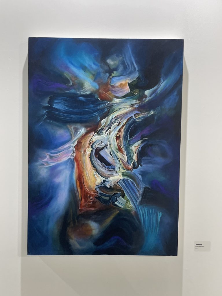
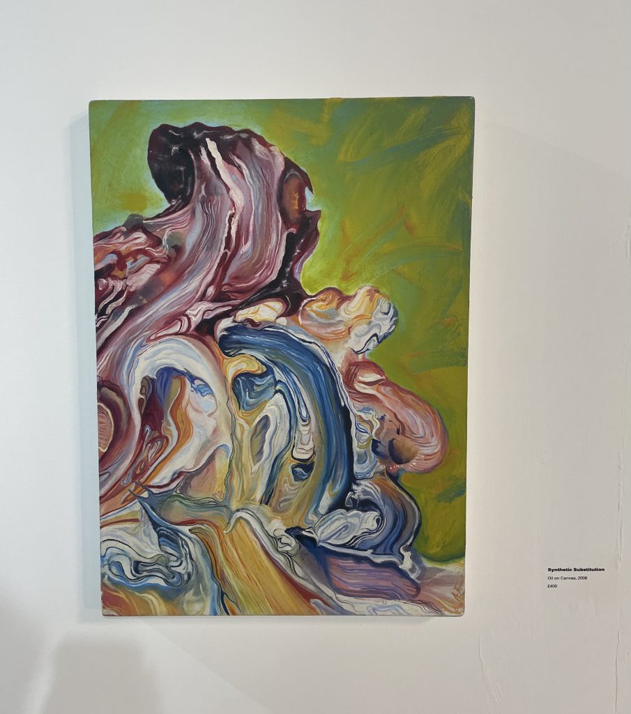
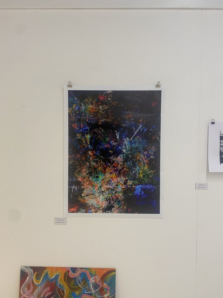
When Birks finishes his reference pieces of art he then moves onto bigger canvases using oil paint to portray the thickness of the paint, and to really capture the thickness he created in the reference pieces. Birks tends to really focus on the movement on the paint, the swirls of mixed paint and all the different shapes and marks. The reason why Birks focuses on the movement of the paint so much is because it depicts the action of the original brush stroke, the paint is frozen in time as its not being touched or moved around any more, its almost like a still life.

Birks creates these reference pieces as a starting point, however then reinterprets them in a new light when it comes to painting the paint onto a canvas. When creating the reference pieces he doesn’t just pick colours at random, there is normally a meaning behind it such as a personal or emotional memories. He also uses the swirls and marks within the reference painting as a way to get that emotion across, he also uses transparent glazes within his work. Not only does Birks focus on the movement, marks and textures of paint within his work, however he occasionally creates work with a figurative element included.

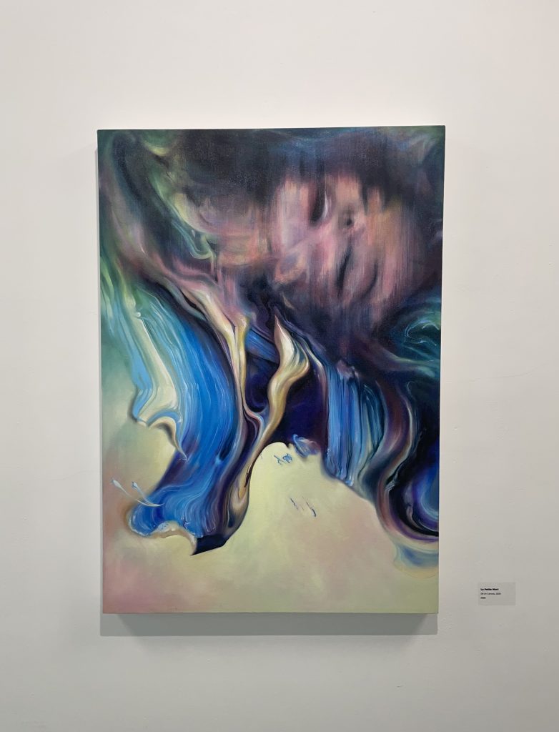
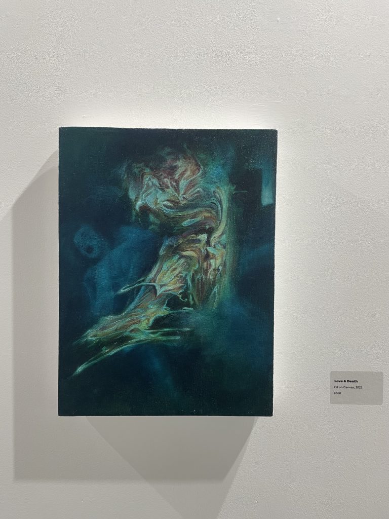
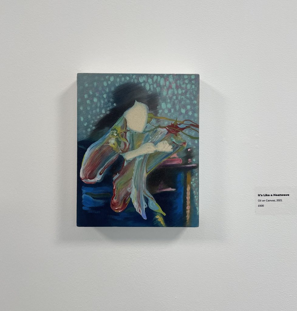
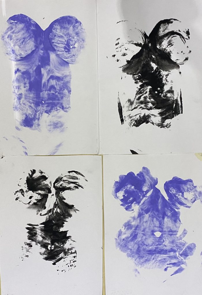
What really interested me in Andrew Birks work art was the movement of his pieces and also all the different marks and textures he has captured from his reference pieces. Just from looking at his work you knew that there is a lot of emotion behind it, you can tell this by the movement he has shown with paint. His work inspired me to become more free and create work more freely as my work focuses on the body which is something that moves freely every day. Birks work also inspired me to spend that extra little time on the reference piece of art or the piece of work that I may not think looks good as in the long run the more effort and work I put into it, it will have a really effective outcome.

Categories
Contextual Research

Mondrian

During the second term I decided to take my printmaking further and continue developing and learning new skills and ideas within print. Still continuing with my theme and the context being about the human body, distorting it and looking at ways we can use our bodies as a material.

I have recently been screen printing an image I edited on pro create as a CMYK print. I distorted my face onto a bit of clear acrylic then decided to edit it on procreate turning it into a thermal looking image the reason behind that was because as humans we are constantly surrounded by thermal things.

Once I started printing the image in a CMYK format, I started printing in the CMYK format and layered up all the colours (cyan, magenta, yellow, black) to create the thermal print that looks just like the photo. However I decided to experiment and not layer up all the colours. So, I layered some of the prints up with just two colours, giving me many variations of different looking prints. I then decided to see what just one colour would look like.

After experimenting around with the layering of different colours, I decided to experiment further and start printing on plastic sheets and acrylic. I started printing just one block colour onto the pieces of acrylic, and moving the pieces of acrylic around, printing in different directions so some were upside down or over lapping an existing print. The overlapping of the prints gave me a variety of different transparent colours, so after creating a couple sheets of acrylic I decided to start layering them up to. After layering some acrylic sheets on top of one another I realised that this looks similar in a way to the artist Mondrian with the block primary colours.

After doing some more research in to Mondrian the more inspired I became. What really interested me about Mondrian’s work is the De Stijl movement, the geometric forms, the primary based block colours and how abstract it is, yet its so simple and empowering. Mondrian limited his colour palette to the three primary colours and also white, black and grey, which has a comparison within my work as I have stuck to the format CMYK which are the colours needed to create a coloured image.

When creating my art work on the acrylic sheets the colours I started off experimenting with were red and blue, once I had assembled them onto the wall it was looking muted and subdued I knew there was something missing. So I decided to use the other primary colour yellow which Mondrian also used within his work, what inspires me with Mondrian’s work is the idea that he depicts the world by only using a limited amount of colour. The fact Mondrian uses a limited colour palette pushed my work further, it made me understand that not every piece of artwork needs vast amounts of colour to look good.

Source from: Mondrian – Bing images
Categories
Professional Research

Curriculum Vitae

Miss Hannah Grace Edwards

Leicester

Email: hannah.edwards01@gmail.com

Phone Number: 07929050509

I am currently studying Fine Art at De Montfort University, my current practice involves looking at the human body and finding ways we can use our body as a material to create art work. I believe I specialise in printmaking the most as its always something I am drawn to when it comes to creating art work, especially the work I am doing at the moment. I am experimenting with different materials and printing my body onto different materials, really looking and examining all the detailed marks its printed.

Education and Qualifications:

2020-Present: Currently studying Fine Art at De Montfort University in Leicester.

2018-2020: Ascentis Level 1 award in understanding British Values. Level 3 award in Art and Design – Merit. Qualifications achieved at Tresham College, Kettering.

2012-2018: English Language – Level 5. English Literature – Level 5. Maths – Level 4. Double Science – C. Art – C. Geography – D. Physical Education – D. BTEC Creative Digital Media Production – Merit. BTEC Digital Media Sectors and Audiences – Pass. Qualifications achieved at Southfield School For Girls, Kettering.

Exhibitions:

28th March – 9th April: I took part in the De Montfort University second year art exhibition. The exhibition was called .TWO. It was an exhibition that took place in the design wing atrium in the University. The exhibition had an opening night on the 28th March and all the art work stayed up until 9th April. There was a combination of different art work such as print, photography, sculpture and painting. I was apart of the committee for this exhibition helping put everyone’s art work up, making sure that the gallery space looked professional and inviting for the audience.

3rd March – 5th March: I also displayed some work in ‘The Ubiquitous Individual’ exhibition that took place at the Two Queens Gallery in Leicester. This exhibition was ran by a group of second year students who fundraised money to hire out the space for the exhibition.

Publications:

Print Edition: In the first term I also did a Print Edition where all the print students had to create this edition, where we had to create a magazine, book, box, folder with one piece of our print work in it. We decided to go for an A3 box to compromise with everyone as some people created bigger scale work whereas some people created smaller work. We had to order around 30 boxes as every print student was given a box also some of the print lecturers and I think one got put up for auction. We then had to create our own 35 plus prints so we could put one piece of our artwork into each box.

Other Achievements:

Not only was I apart of the committee for the exhibition .TWO. however I am also apart of the fine art society, me and three other students decided to get the fine art society back up and running. My role within the society is being the health and safety officer, so making sure risk assessments are being done and making sure no one gets hurt or becomes ill whenever we do anything outside of University. After having a tough first year due to covid we thought that having this society was a nice way to bring everyone together and do things together outside of University. For example we are wanting to do field trips where we go and visit exhibitions across the UK and do fun art activities all together.

Categories
Contextual Research

Yves Klein

At the beginning of the second year I knew that I wanted to do more work about the body and us human beings. I wanted to explore the idea on how us human beings are constantly leaving marks within the world, I was also extremely interested in all the small marks and details we have on ourselves, I also wanted to explore how I could use myself as a material.

So I explored a few artists that produced work about the body and exploring the way we can use our body to produce work. Yves Klein ‘Anthropometries’ came up the most when doing my research. Klein is best known for doing his performance pieces with female bodies. He demonstrated art and performance pieces through using naked female bodies as a human paint brush. Klein conducted the women to cover themselves up in paint (in the famous Yves Klein blue) and then print themselves on the pieces of paper Klein had layed out, while the females were performing Klein also had a musicians play a single note for twenty minutes followed by twenty minutes of silence.

Yves Klein’s art work has always been an inspiration of mine, as its a very unique and different way of making art in the 1960’s. I think that the marks are beautiful and so impressive and imposing, another thing that I find so interesting and inspiring with the work is that no mark will be the same, they all contrast from one another as the marks are all so different. That’s what I love with Klein’s work is the layering of some of the prints and the messiness of some of it, where some of the paint has been smudged. You can also see a contrast between the colours of the paint from where the first mark was made to where you can see the colour becoming lighter from where the paints slowly being rubbed off.

After doing some depth research into Yves Klein, I knew this is something that I wanted to experiment with, so this was my starting point at the beginning of the second year. I decided to lather myself up in paint and begin printing my body onto paper, not only did I use paint however I also used purple shampoo which gave a really effective outcome. The purple shampoo stuck really well to my body printing really fine details from my body that not even the human eye can see, for example when printing my body with the purple shampoo it left hair marks that were on my stomach, it showed all the fine lines and all the blemishes, which is what I wanted. The purple shampoo definitely worked better then the black paint, even though the black paint did not work as well as the purple shampoo I didn’t hate the outcome, I still admired the way it was printed almost making it look a lot like Rorschach test.

Source from: Yves Klein – Anthropometries | TateShots – YouTube
Categories
Professional Research

DMU Design Wing Atrium Exhibition

I also displayed some work in another exhibition which took place in the DMU design wing atrium, not only did I exhibit some work there however I also became one of the committee members. It was run by me and a group of second year fine art students. There was a meeting held by Gino and a group of students, this meeting explained into depth how long we had the space for, when the art work needed to be up for and we also spoke about all the different roles and responsibilities within the exhibition. Once all the roles had been assigned the first step was to set up a group chat with everyone in, so we all had easy access communicating with one another. After the chat had been made the next step was to get a poster and a submission form sorted as we only had a week before the artwork had to be installed.

The reason why the poster needed to be one of the first things to get sorted was because we wanted to advertise to all the students that there would be an exhibition taking place and to also give everyone the opportunity to submit any work. We then sent around a submission form to all the students, we had to do this quickly as we had very little time to get the art work up so we needed to see who was submitting what and try and figure out where everything would go. Within the submission form, it required measurements of everyone’s work, an image of what they were submitting and also a description on how they wanted it to be installed (bulldog clips, nails, on a plinth etc.)

Once the deadline had passed for the submission form we then began planning out where everything would go which was one of my roles for the committee, another role of mine was to help install the work. When planning out where everything would go there were many problems that needed to be solved, for example where some of the sculptures would go as we didn’t want any ones art work to be blocked or obstructed. Also making sure everyone’s work was visible and noticeable on the wall for the audience to see. We also needed to have equal spaces between each art work so it looks professional, also making sure that there was enough room for the audience to walk around and view the art work as we had plinths so we didn’t want anyone knocking them over or struggling to get around. After dealing with all the risk assessments we began installing the art work.

When installing everyone’s art work we needed to make sure everything was displayed correctly also making sure everything was secure on the wall, floor, plinth and so on. We also needed to make sure we had all the materials and equipment to assemble the exhibition, so we made sure everyone brought their own nails, bulldog clips and equipment and began putting the work up.

Categories
Professional Research

Two Queens

I recently took part in an exhibition that took place in Leicester, in the Two Queens Gallery. This exhibition was held and run by a group of second year students. The title of the exhibition that took place was called ‘The Ubiquitous Individual’ to be ubiquitous is to be found everywhere, the individual is everywhere, you just have to look.

I decided to put two pieces of artwork into this gallery as the pieces of artwork I displayed really complemented each other and looked more effective besides one another. The entry fee for the gallery £5 however it was an extra £3 to put an extra piece in which I did as I believe both of my prints really did work well together.

Here are the two pieces of artwork I submitted to the Two Queens art exhibition. The pieces of name do not have a title to them. There were a few issues and problems getting these printed off, when I first originally printed the pieces of art work off on the wide format printer they came out very dark and dull looking, they almost looked like a black sheet of paper, I also realised that they were on matt paper, which may have been on of the many issues. After doing some editing on Lightroom on a mac book, making them brighter and also alternating the saturation on it, as when you look at an image on your phone or laptop it automatically makes it brighter for you where as if you printed it out it would look completely different, a lot darker. So after doing some editing on Lightroom, I then decided that it would look a lot more interesting and vibrant on glossy paper as it would make the colours really pop and shine through.

After deciding what paper to print it out on, I then had to decide what size to print it out, so I printed the two pieces of art work out in size A1 and also A2. The way I made my decision was to hang them all up on the wall and to see which ones were more effective, so by slowly walking back and looking at my art work I realised that the further you walked back the more you started to lose the marks and colours within the size A2 one. I wanted my work to be noticeable and effective from a distance, where you could see all the fine lines and all the different layers so in the end I decided to go with A1. When printing the print a bigger size I noticed that it had started to lose focus, some of the details started to become fuzzy and blurry which was really disheartening to see as I wanted them to be perfect. However I managed to resolve that problem with Lightroom, it didn’t make the print perfect however it did sort out most of the blurriness.

Another issue I had when deciding how I was going to install my work was how I would hang it on the wall. I originally wanted to frame the prints and then hang them on the wall however due to the prints being printed on glossy paper, it would create a shine between the glass and the glossy print which would create a blind spot where the audience wouldn’t be able to see my art work due to there being a shine on it. So I decided to hang them up bull dog clips and hammer the bottom section to the wall to prevent the art work from curving.

Here are my pieces of artwork displayed on a screen.

These images were taken on the opening night which took place 3rd March. The opening night was very effective and a lot of people came to support and see all the amazing art work.