During the second term I decided to take my printmaking further and continue developing and learning new skills and ideas within print. Still continuing with my theme and the context being about the human body, distorting it and looking at ways we can use our bodies as a material.
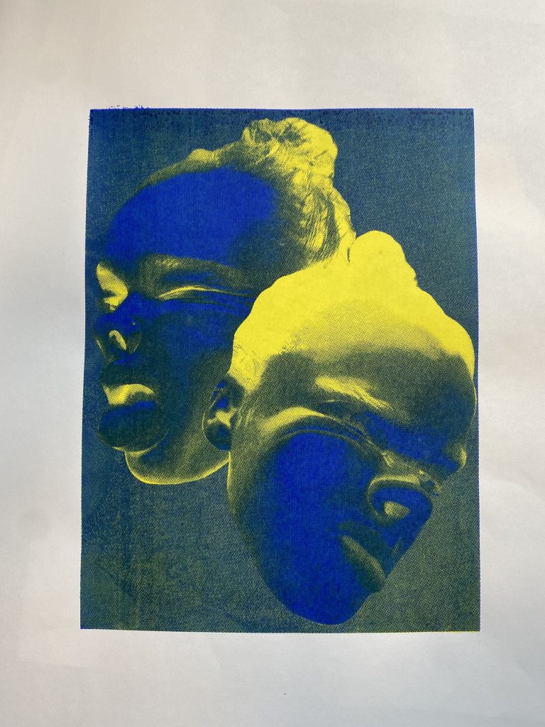
I have recently been screen printing an image I edited on pro create as a CMYK print. I distorted my face onto a bit of clear acrylic then decided to edit it on procreate turning it into a thermal looking image the reason behind that was because as humans we are constantly surrounded by thermal things.
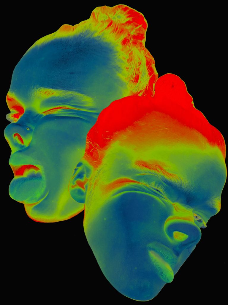
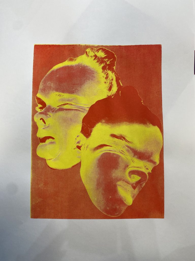
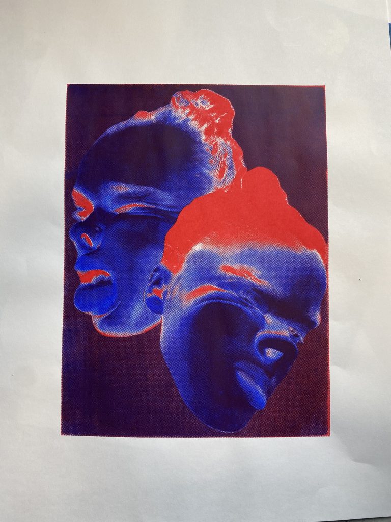
Once I started printing the image in a CMYK format, I started printing in the CMYK format and layered up all the colours (cyan, magenta, yellow, black) to create the thermal print that looks just like the photo. However I decided to experiment and not layer up all the colours. So, I layered some of the prints up with just two colours, giving me many variations of different looking prints. I then decided to see what just one colour would look like.
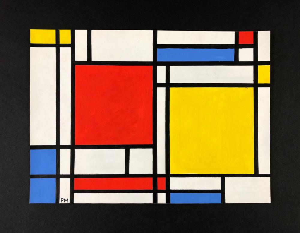
After experimenting around with the layering of different colours, I decided to experiment further and start printing on plastic sheets and acrylic. I started printing just one block colour onto the pieces of acrylic, and moving the pieces of acrylic around, printing in different directions so some were upside down or over lapping an existing print. The overlapping of the prints gave me a variety of different transparent colours, so after creating a couple sheets of acrylic I decided to start layering them up to. After layering some acrylic sheets on top of one another I realised that this looks similar in a way to the artist Mondrian with the block primary colours.
After doing some more research in to Mondrian the more inspired I became. What really interested me about Mondrian’s work is the De Stijl movement, the geometric forms, the primary based block colours and how abstract it is, yet its so simple and empowering. Mondrian limited his colour palette to the three primary colours and also white, black and grey, which has a comparison within my work as I have stuck to the format CMYK which are the colours needed to create a coloured image.
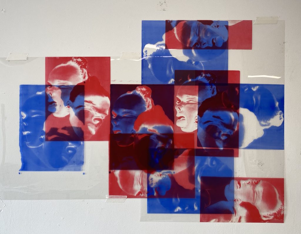
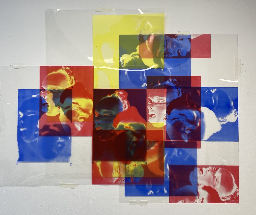
When creating my art work on the acrylic sheets the colours I started off experimenting with were red and blue, once I had assembled them onto the wall it was looking muted and subdued I knew there was something missing. So I decided to use the other primary colour yellow which Mondrian also used within his work, what inspires me with Mondrian’s work is the idea that he depicts the world by only using a limited amount of colour. The fact Mondrian uses a limited colour palette pushed my work further, it made me understand that not every piece of artwork needs vast amounts of colour to look good.