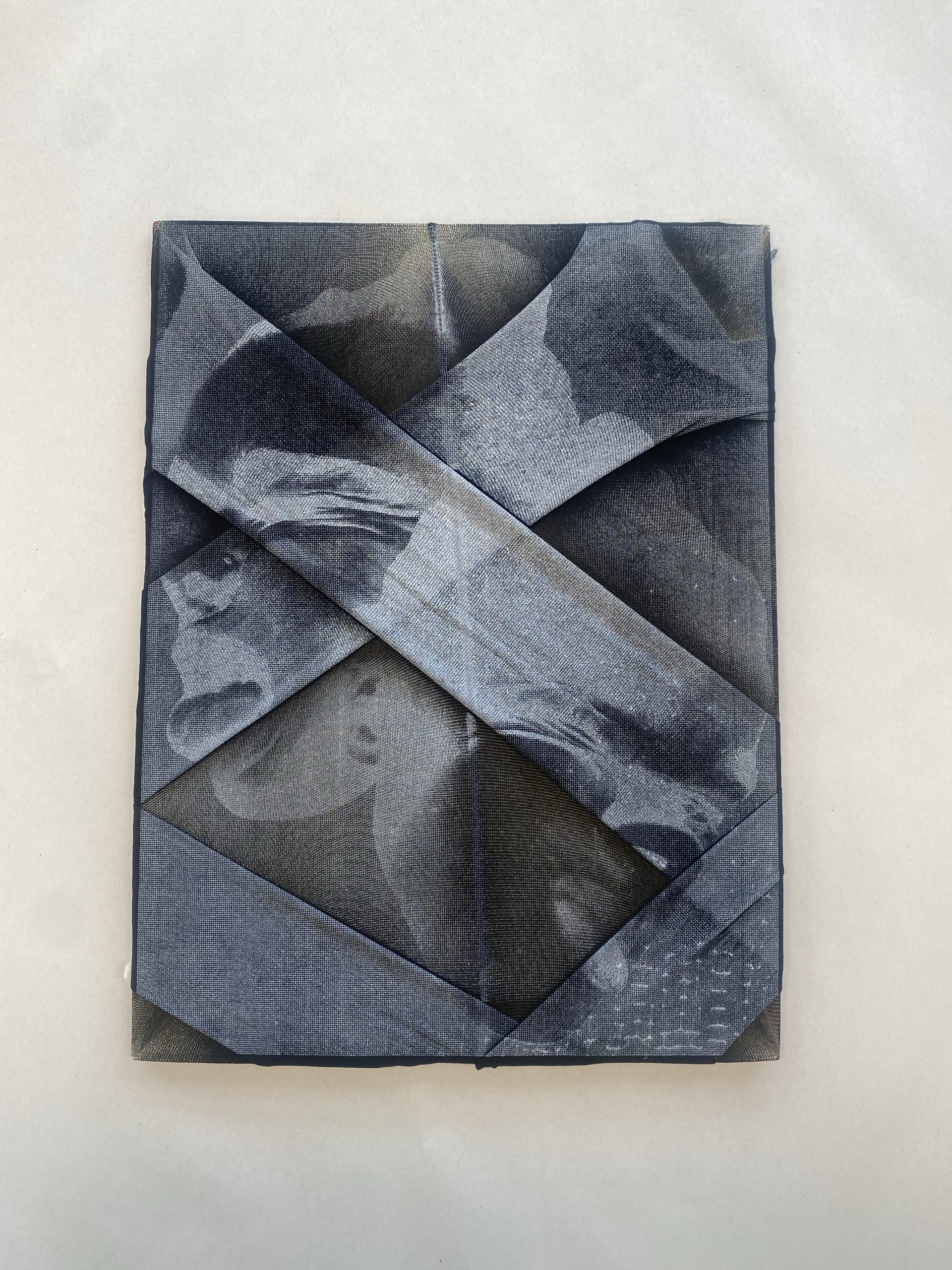
Screen printing has been used commercially since the 1920s, but it first emerged as a creative medium among artists in 1930s America. Traditionally referred to as silkscreen printing, also known as serigraphy. It is a versatile printing technique that involves transferring ink through a mesh fabric, with certain ‘non-printing’ areas blocked off using glue, lacquer, or other resist materials. Over the years, this method has evolved, but its core process remains rooted in both craftsmanship and experimentation.
There are multiple approaches to preparing a screen, each offering unique creative possibilities. One can apply adhesive film or cut paper stencils directly to the screen, or use a light-sensitive emulsion that is exposed and developed photographically. Once the screen is prepared, ink or paint is pushed through the open mesh using a squeegee, allowing the design to transfer onto the chosen surface. What I find particularly compelling about printmaking is the element of unpredictability, each print is slightly different due to subtle changes in ink, pressure, or layering. This inherent variation makes each piece unique and adds a tangible, almost tactile quality to the final outcome.
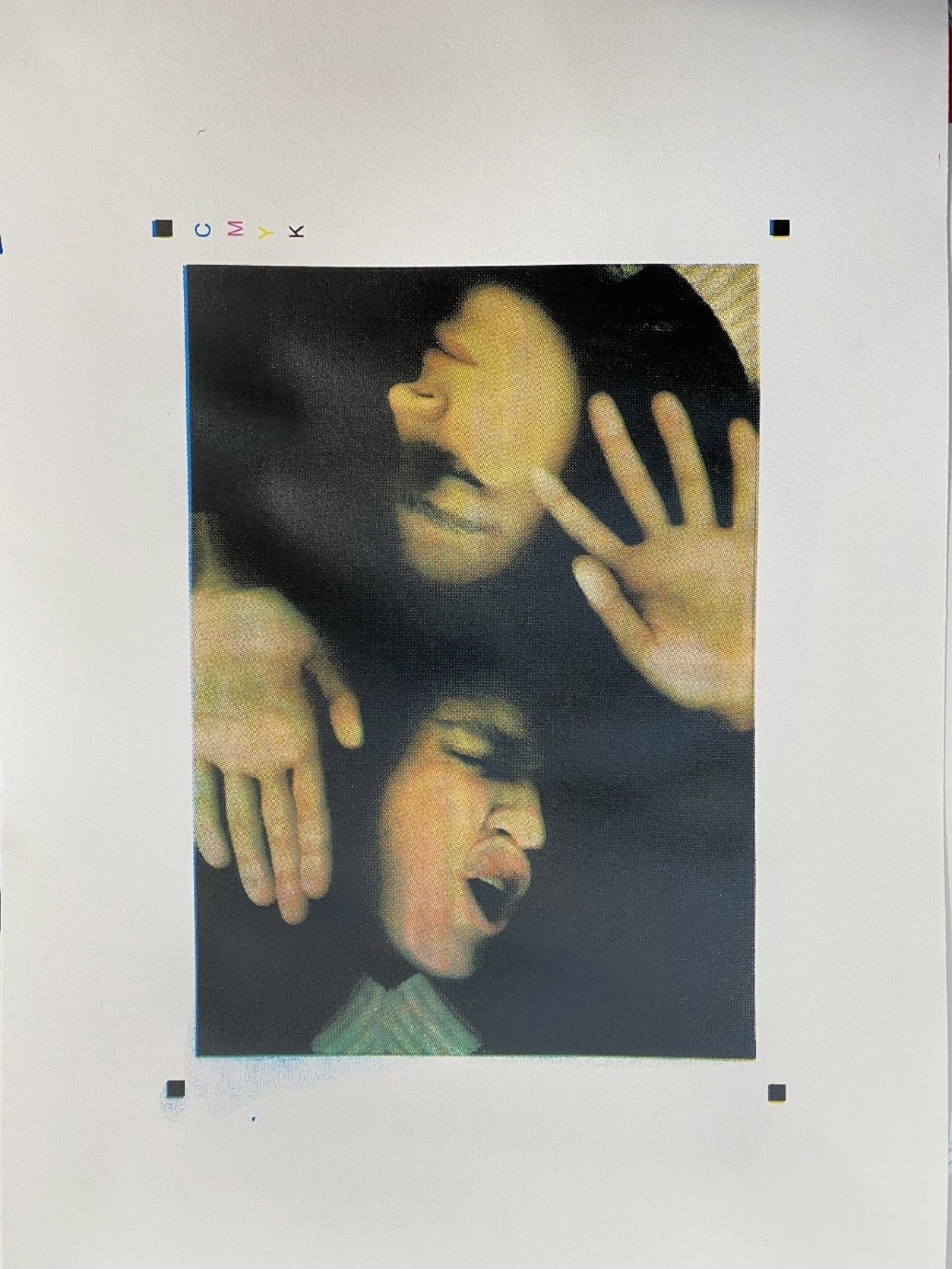
My passion for printmaking began when I started university. I had never encountered the process before, but I was immediately drawn to its experimental nature and the wide range of techniques it encompasses. From my very first CMYK prints to the work I produce today, I have seen a clear progression in my skills and confidence. I now feel comfortable printing on various fabrics and surfaces, and I enjoy challenging myself with bold colour choices, layering techniques, and composition. Screen printing has become a tool for me to explore artistic expression in a hands-on and deeply rewarding way.
One technical aspect I’ve learned to navigate is working with acrylic paint. It’s essential to mix it with a screen printing medium before use, as pure acrylic would dry too quickly and clog the mesh. The standard formula is typically around 75% medium to 25% paint, though this ratio can be adjusted based on the desired intensity of the colour. A higher concentration of paint yields richer, more vibrant results, while a greater amount of medium produces softer, more translucent tones. This control over opacity and colour strength adds another layer of creative decision-making to the process.
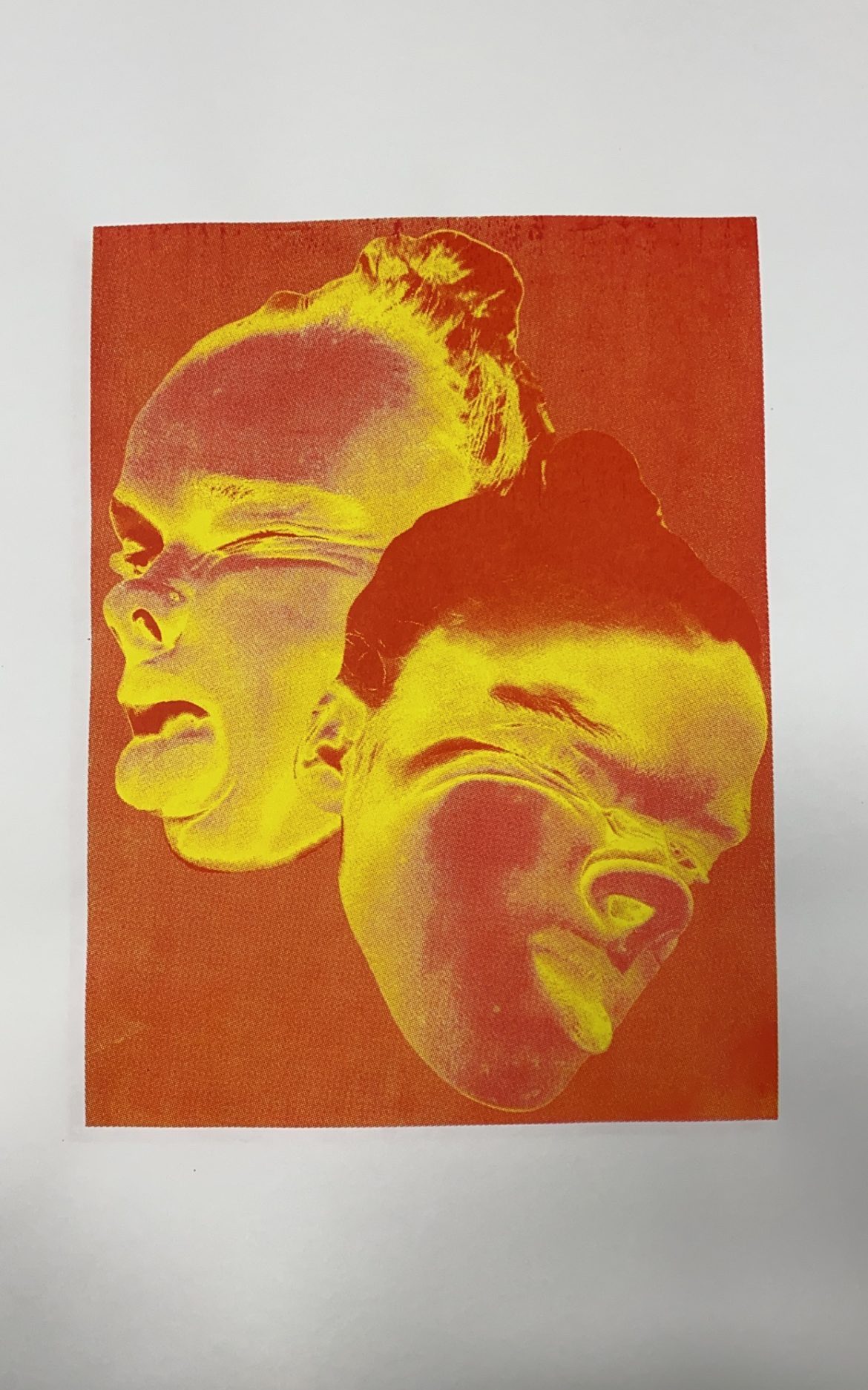
The technique I’m most passionate about is CMYK printing, cyan, magenta, yellow, and black. CMYK is a subtractive colour process that relies on overlapping tiny dots of transparent ink to build full-colour images. Rather than blending the colours before printing, each is layered individually in a specific dot pattern, which optically mixes to create a photographic effect. The process masks the white of the paper, and the more ink applied, the less light is reflected, resulting in deeper tones and shadows. I’m fascinated by how a set of four basic colours can be manipulated to produce complex, high-contrast imagery with such visual depth. The challenge of precise registration, combined with the creative possibilities of layering and colour mixing, continues to push me to refine my technique and expand the boundaries of my practice.