Categories
Contextual Research

Artist Talk-Simona Dossi and Anna Meyer

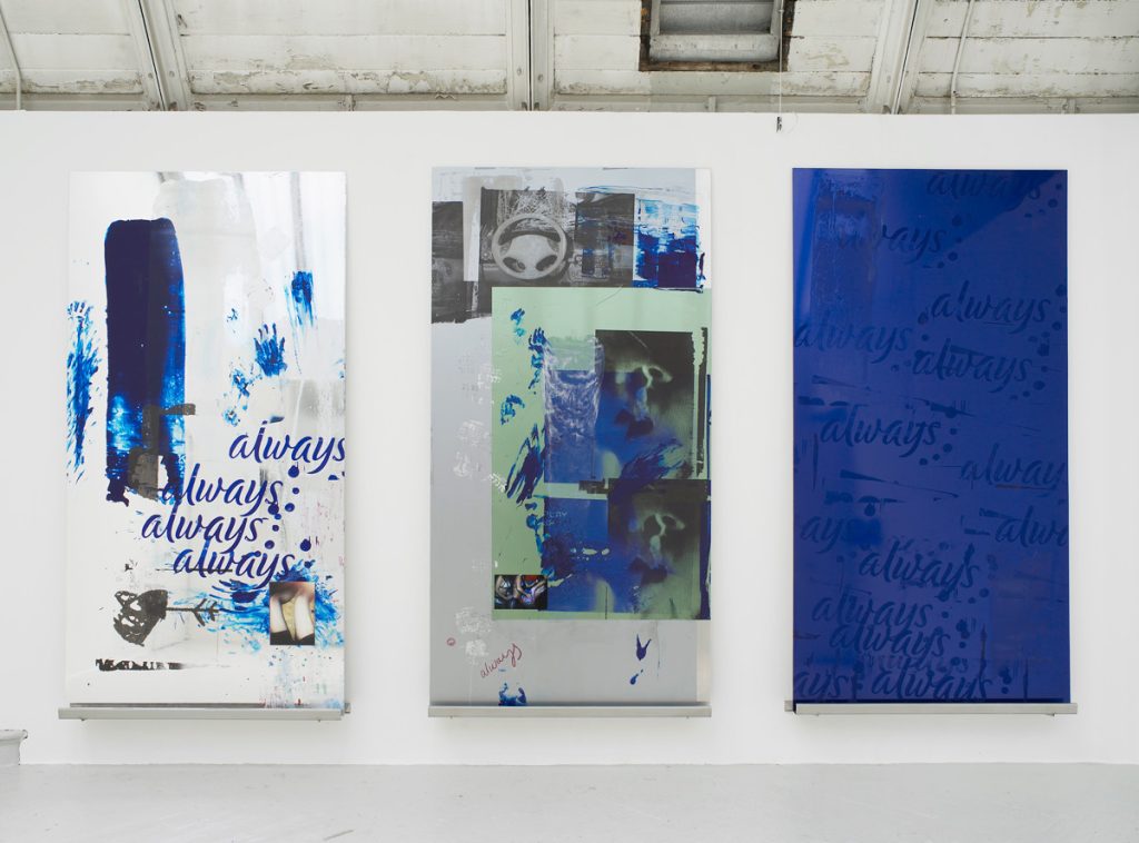
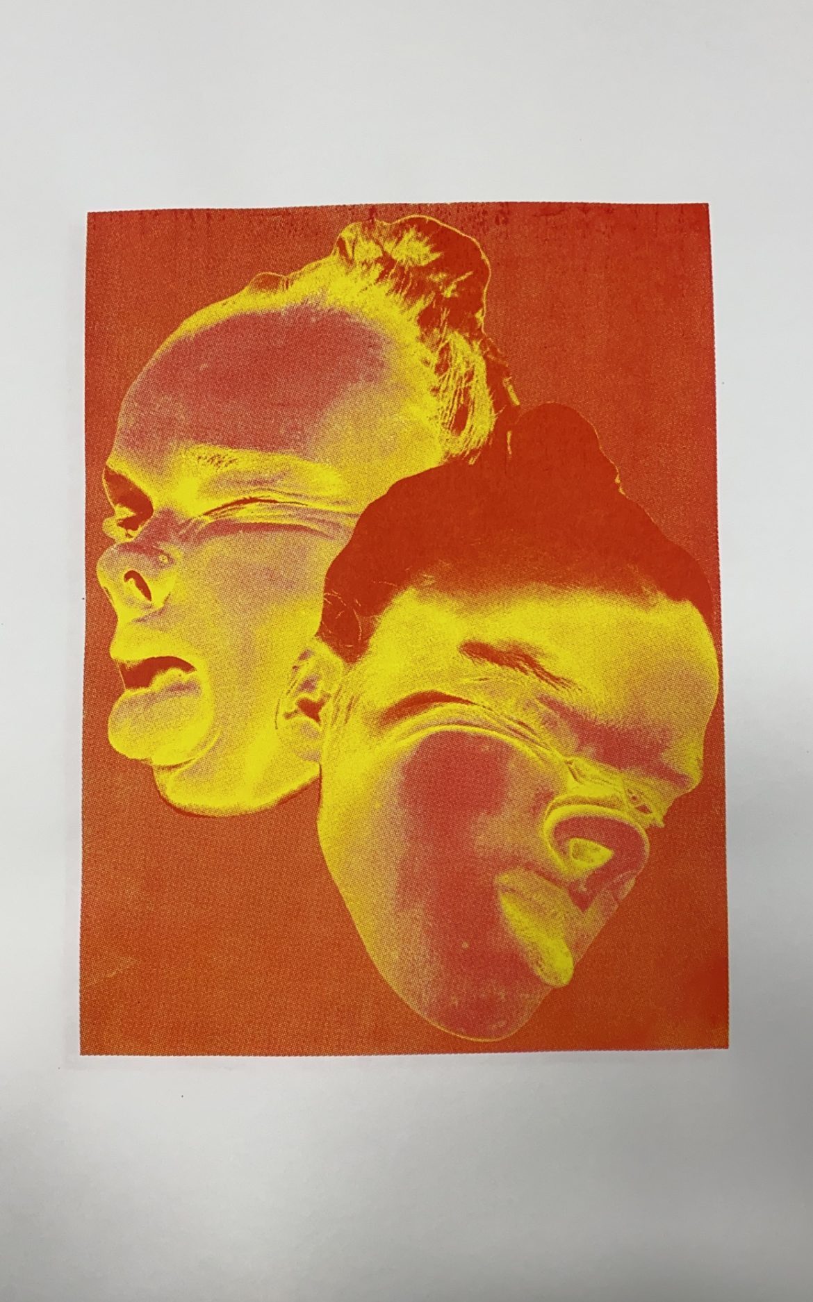
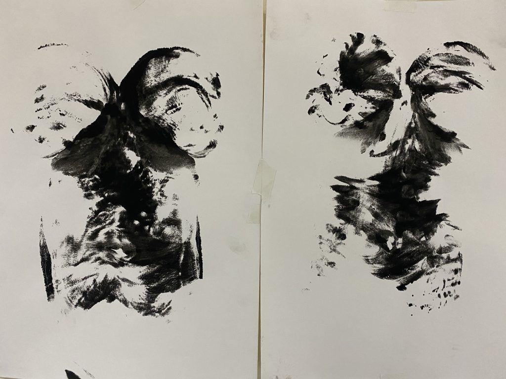
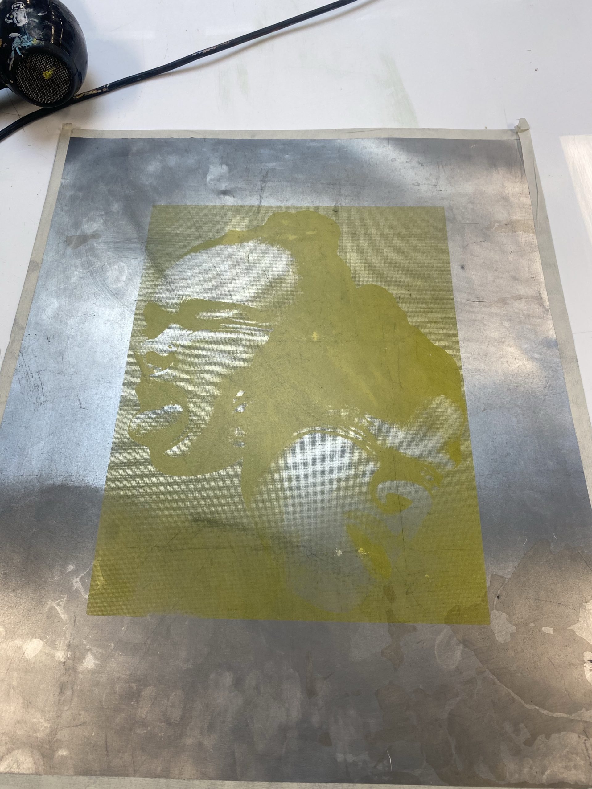
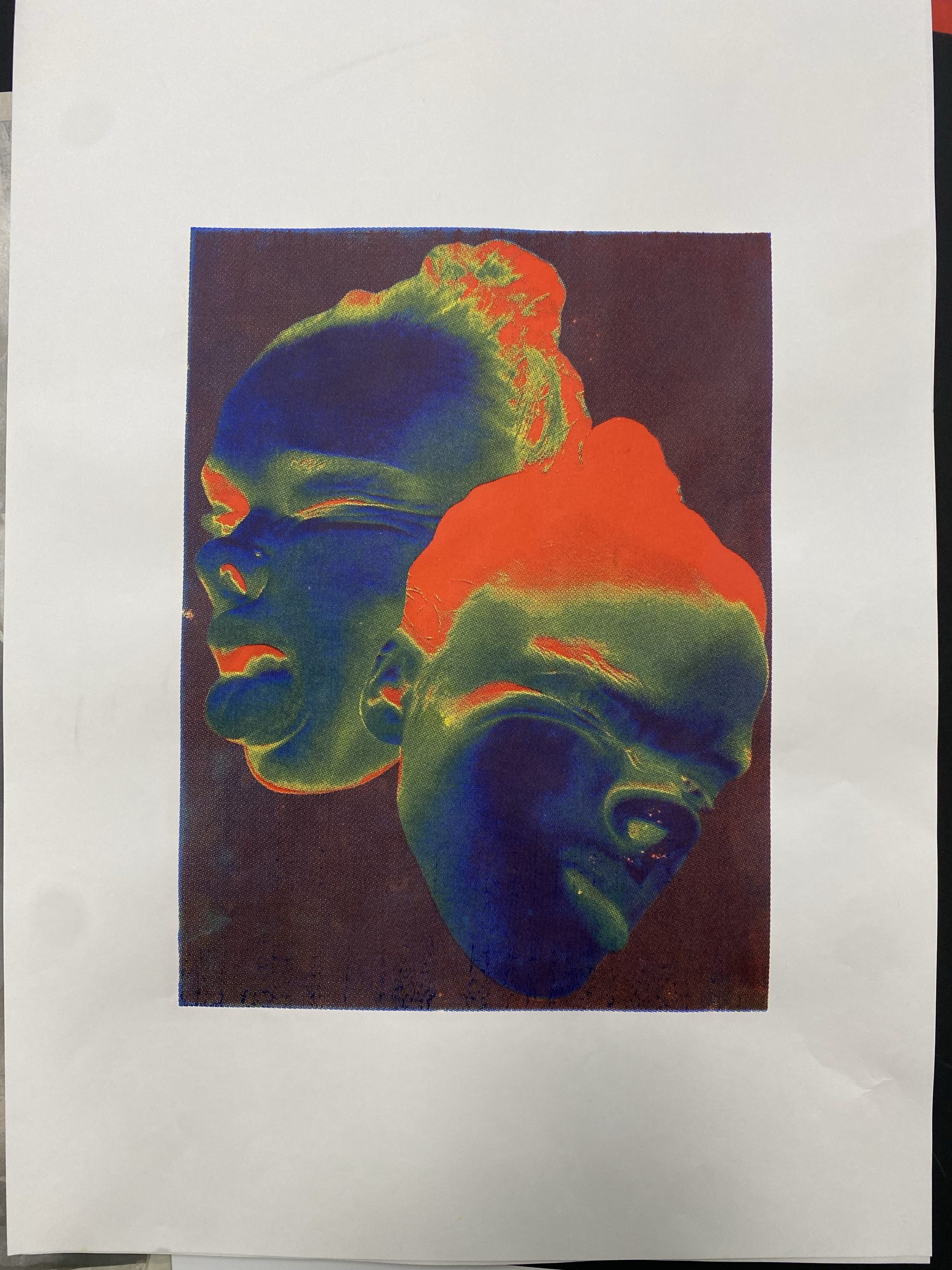
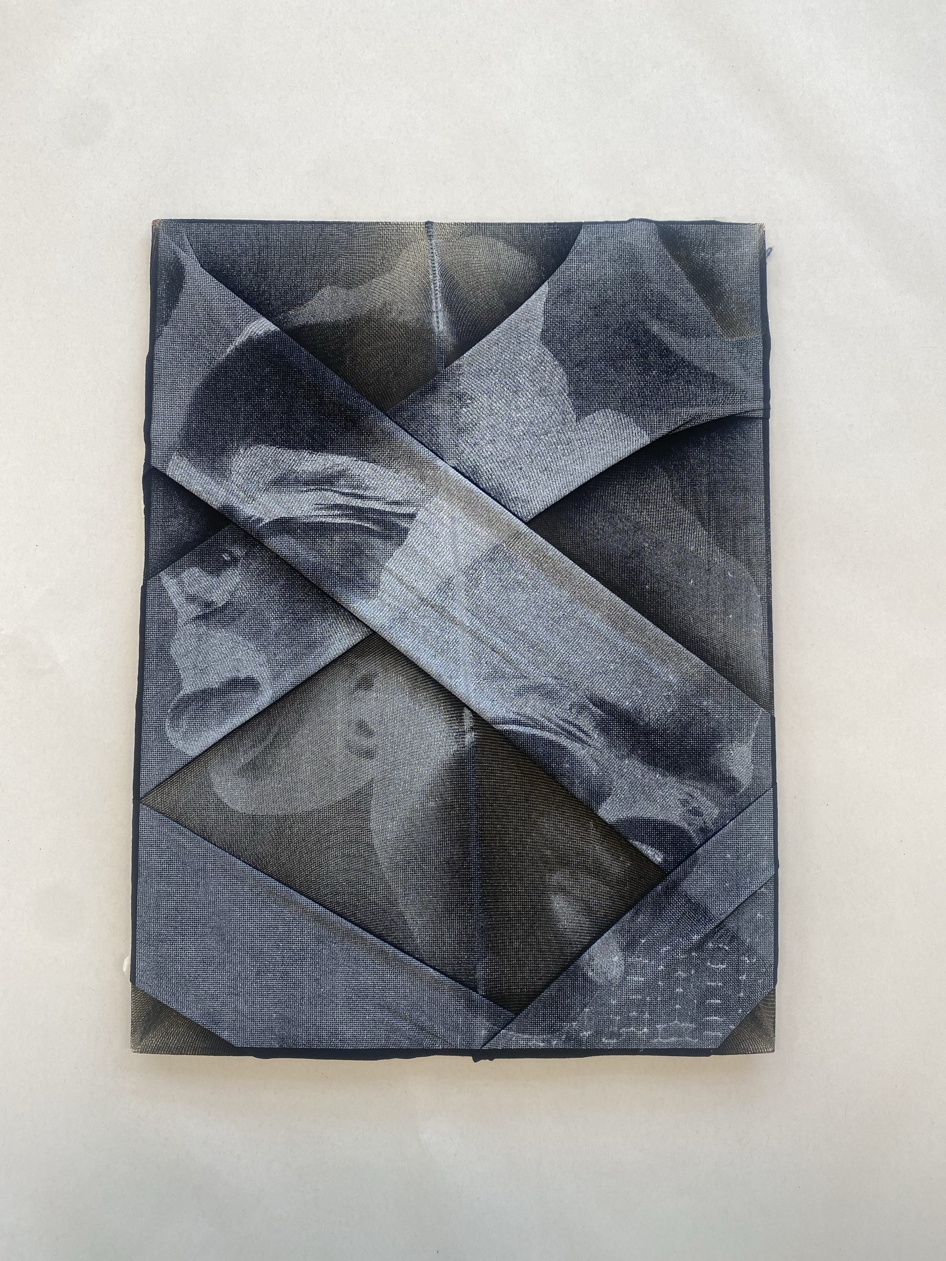
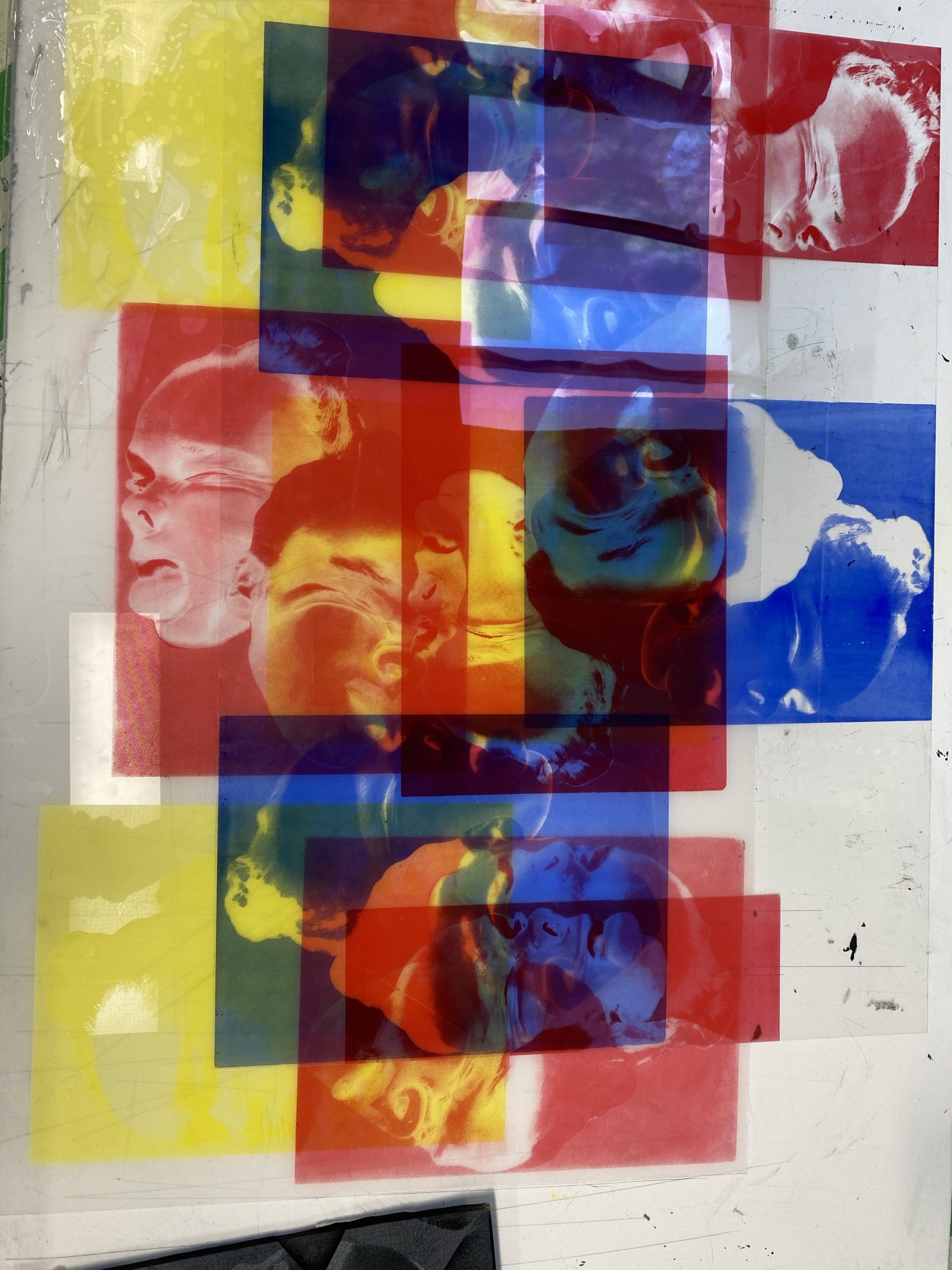
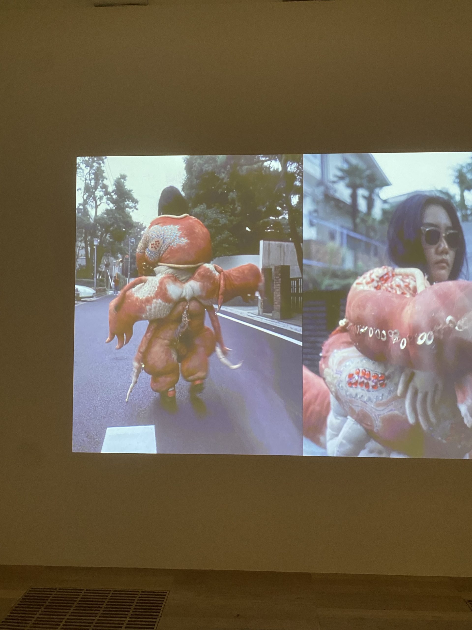
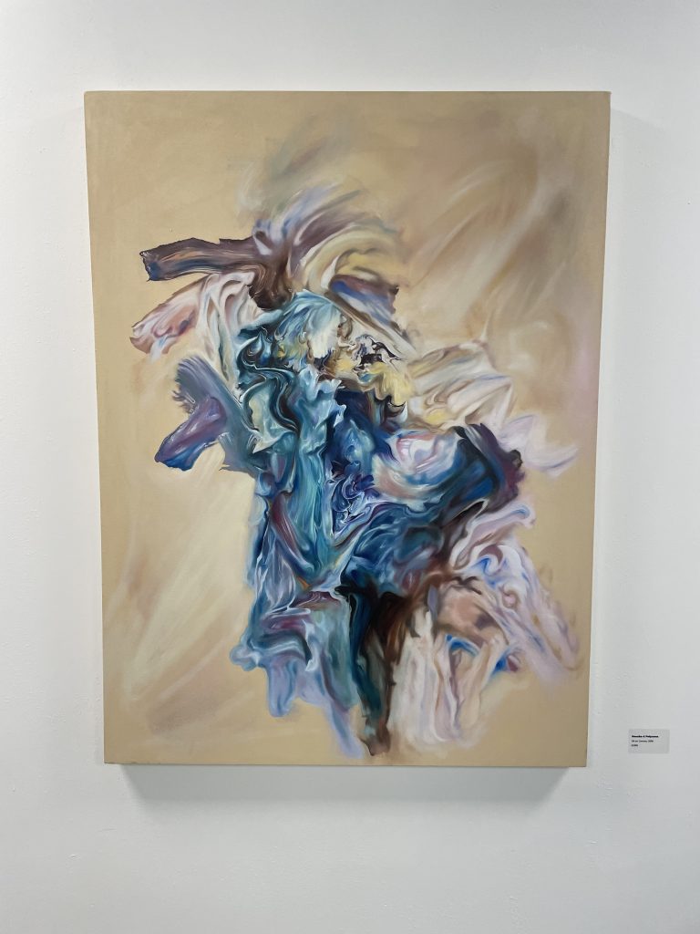
Anna Meyer was very fascinated by literacy, poetry, novels at a young age and landed a few jobs in book publishing. She studied literature and gender and got a Bachelors degree. Anna worked in book publishing very briefly, however she became rather interested in the mechanics of book production and this then led Anna to print making, and eventually found sculpture later down the line. Within her art work she is interested in iconic patterns, camouflage, and she was also interested in the history of the crafts.

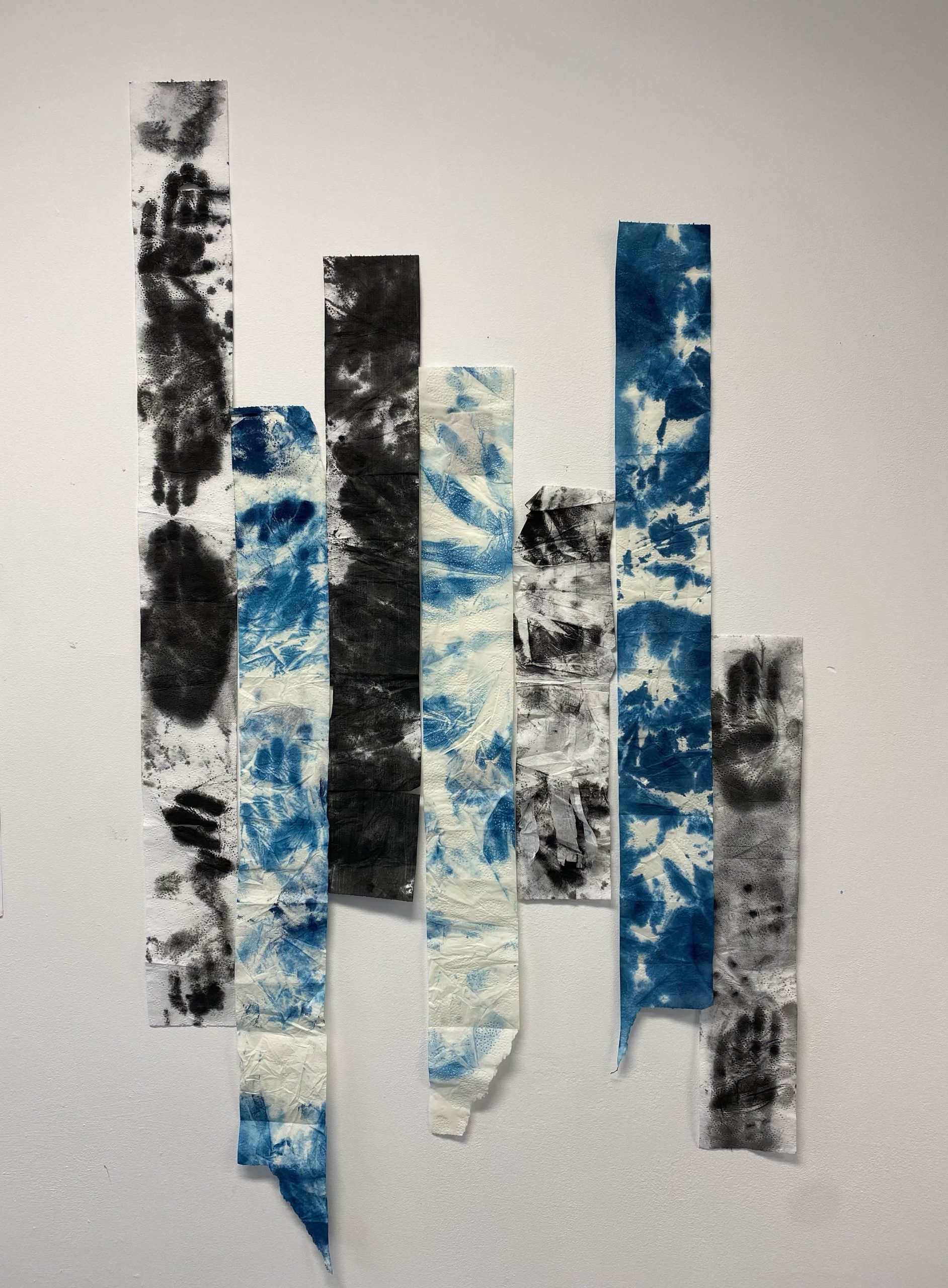
After Anna Meyer completed her degree she was drawn to ceramics and terracotta, and would dig a hole to put her ceramics in and then would build a fire on top of it. She was thinking about how she could harness fire exploring different ways she could make her ceramics. In 2008 Anna Meyer created a project called ‘Fireful of Fear’ she made 12 ceramic sculptures that she put out in the landscape of Malibu, California, the idea behind this is that the sculptures would stay in the landscape until they got fired by wild fire. 10 years into the project 2018, there was a huge fire that broke out the ‘Woolsey fire’. Anna managed to pull 4 of the ceramic pieces from the fire.

Source from: fireful of fear – Bing images

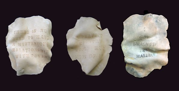
Anna discusses about one of the causes of global warming which is the increase of these fires that are happening more frequently and are becoming more intense. She then goes on to say that her project ‘Fireful of Fear’ has become a marker for global warming, which was not her intention.

Predicting Fire – Anna Meyer and Simona Dossi

Simonas PhD research topic is how to reduce wildfire ignition risk of rural buildings in southern Europe. The research is about looking at the fire exposures that you get from fires to houses, and what their house structure is built like and whether the fire will destroy the house. Anna Meyer and Simona Dossi are doing a collaboration within the wild fire, they are both learning new stuff about art and the wildfires, also discussing ways to decrease global warming.

In respect to the artist talk and listening to all the valuable insights from these curators and PhD student. It has allowed me to value art from another perspective as not many artists collaborate with students, the fact that they have now made a mark and recognition to help reduce the wildfires and help global warming. Science requires a very narrow focus, but the possibility not to get to closed off and to work together as artists, as well artists are opposite in a way they are always figuring a way to go outside the box and not have a methodology.

Categories
Contextual Research

Artist Talk – Julia Hadji-Stylianou

Julia Hadji-Stylianou completed a foundation degree at De Montfort Universirty in 2009, she then went on to pursue a Bachelors Degree in photography and video in 2012, and then followed by a Masters Degree in photography in 2014. She now currently works as an image re toucher for Next. A lot of Julias art work focuses on making a connection between identity, sense of self, places and location.

At the beginning of the artist talk Julia talks more into depths about her themes. The idea that identity has a lot of sub categories such as gender identity, social identity, it can be massively influenced and shaped by people, nationality, community, or it can be influenced from just doing your normal day to day life. She talks about being half British and half Greek and goes on to say she’s been travelling between the two her whole life, she constantly shifts from one place to another, she has explored how the land and location is also a big influence with your identity. Julia follows on by talking about the fact that our identity’s shift and change over time, everyone is constantly changing which she demonstrates from self portraiture and portraiture photography.

Here is a long exposure portrait created by Julia, she felt that the long exposure photography really reflected our identity being obscured, shifting and changing, She then developed her portraits further by adding glitch art on top of the long exposure portraits. The glitch going across their faces communicates lost or blurred identity, relating to dreams and dream theories.

Julia then moves onto talking about her next series the ‘non compos mentis’ in this project Julia focuses more on the conscious mind instead of dream theory. The conscious mind is everything we are aware of such as our emotions. Julia explains that she had bad anxiety that really affected her however she used this within her work she wanted to portray her mental health within her portraits. The long exposures are meant to indicate in this series doubt and unpredictability, and how her mind was spiraling.

Julia scouted out abandoned places to take more portraits for this series, the location massively influences the photographs more giving it the ‘run down’ look. The purpose of finding abandoned places Julia explains she wants to communicate the idea of her mind and her world feeling run down alongside the exposure. Her imagery is slightly desaturated in colour to convey this notion mental health, depression and anxiety can suck the colour out of you and it can be very physically and mentally tiring and draining.

Source from: julia hadji stylianou photography – Bing images
Categories
Contextual Research

Hannah Perry

Hannah Perry mainly produces work that involves installation, printmaking, video, and sculpture. Perry manipulates and generates multi media materials and develops them into her art work which portrays the hyper-technological society we live in. Perry demonstrates personal experiences and videos that are then juxtaposed with video archives, creating a collage of universal experiences that reflect the reality of being young such as sex, power, and gender.

Perry uses her own intimate personal images and videos and documents them to use for her art work. Once Perry has collected all her images, videos and sounds she combines them all together and then displays monitors around her installation such as her metallic sheet sculptures, where the sound is so loud and has such a low bass to them that it ripples through the metallic sheets creating waves.

What really interests me about Hannah Perry’s work is the metallic sheets she creates, as this is something I am experimenting around with within my practice. I am screen printing my distorted face onto this scrap aluminum sheet, the aluminum sheet is covered in blemishes and scratches however this adds to my art work, the idea that you don’t have to be perfect and nothing is really ever perfect. The scratches add a nice contrast between the screen print and the background.

Perry’s video and installations explore stereotypes generally associated with femininity and hysteria and also looking at machismo and industrialism and juxtaposes them, she explores all of these and creates art work depicting the idea that women are more machismo now and roles have reversed however we are yet still being criticized and judged as females within todays society.

“Perry’s work sits well alongside that of older artists like Mark Leckey or Dara Birnbaum as well as the post-internet new wave that have been so active in recent years. She has a cut-and-paste style that feeds on an awareness of gender, social class, lifestyle, and her own experience. “It’s not really about me as a character, more about one’s experiences,” she points out. Decidedly nonlinear, the work is “about things getting confused along the way and a bit messy.” from: Up and Coming: Mounting Her U.S Debut, British Artist Hannah Perry Plays a Deconstructed Film to an L.A. Audience – Artsy

Source from: Hannah Perry: GUSH – YouTube
Categories
Contextual Research

Screen Printing

Screen printing has been used commercially since the 1920s. It first began with artists in 1930s America. Screen printing was traditionally called silkscreen printing also known as serigraphy. It is a printing technique where a mesh fabric is used to transfer ink, apart from the ‘non printing’ areas that are blocked off by glue or lacquer. There are many different ways you can assemble the screen such as applying adhesive film or paper, or painting a light sensitive resist onto the screen which is then developed as a photograph. Once the screen is set you then begin to glide paint across the mesh fabric with a squeegee.

With the acrylic paint you have to add a medium to the paint before using it onto the screen. If you used pure acrylic paint it would dry up in the mesh screen, so the formula is normally 75% medium 25% paint however this changes depending on how dark or light you want your colour, the less medium you add the darker and brighter it will be, however the more medium you add the lighter the colour and the more faint it will be.

There are many ways you can screen print however the technique I am drawn to is CMYK, cyan, magenta, yellow and black. CMYK is a subtractive method of printing that relies on layered dots of colour to mask the white background of the paper, if there’s more ink on the paper this means less light that reflects. CMYK inks are applied in set patterns of tiny dots that appear to create a solid colour. The colours needed to make a coloured image are CMYK so once you’ve finished layering up the individual colours you will get a pixilated dotted print that looks similar to a photograph.

The reason why I am so drawn and passionate towards print, is the fact that each individual ink or printing method gives you a slightly different result, so no print is the same, there are many different variations within print. Also the freedom to mix up colours and create different prints by swapping the colours or by layering up only a certain amount of layers to create this contrasting print. I was introduced to print when I first started University, I had never done it before so I was eager to learn all these new different techniques. Looking at my CMYK prints from my first ever attempt to my current work now, I believe my work has developed massively, I am now confident enough to screen print of different fabrics, and experiment with colours, enabling me to push myself further and challenge myself within art.

Categories
Contextual Research

Studio Practice

I believe my work has developed massively from the first term up until now. I have always been interested in going against society’s norm of the definition of beautiful and finding ways of distorting the human body, making it appear gruesome and ugly. When it comes to art I have always been drawn to printmaking and this is something I have really focused on throughout the year, learning new techniques and developing my skills further within print. At the beginning of first term I decided to use my body as a material to print with, finding different mays I could create art work with my body.

I experimented with a variety of materials such as purple shampoo, printing ink, paint and I also used toilet paper. My work here demonstrates a variety of ways I experimented with to use my body as a material such as covering myself in paint and printing my body onto paper, to rolling ink out on the floor to create a monoprint to capture my movement while I walked to different locations. My work consisted of exploring many printing techniques and a lot of my work consisted of none stop experimenting.. Not only did I want to explore different ways that I could use my body as a material however I also wanted to interact with the art so it became more personal, so by using my self to paint with instead of someone else this instantly became personal to me as they are my prints of my body.

I decided to carry the theme on into the second term as using the human body is something I am always passionate about as well as printmaking. So, I continued experimenting finding different ways to print and create artwork using different materials such as aluminum, fabrics and layering up acrylic sheets. I also decided to broaden my theme, instead of just focusing on using my body as material, I started to look at how us humans leave marks within the earth, marks that may not be visible to the human eye. I decided to develop those thermal prints I did in the first term and create a thermal image I could screen print using the CMYK format.

The methodology behind my work was to produce prints by physically using myself as a material interacting with the art, not using the typical printing methods to do so, another aspect of it was that I have always found the human body engaging and interesting, so I wanted to add that to the theme. I wanted challenge myself and continue pushing myself and carry on experimenting. I also went into researching about thermal and about the thermal heat we give off as its something you cant see to the physical eye however when you see thermal footage, the colours are bold and vibrant. After screen printing my thermal image, I decided to separate the colours to just yellow, cyan and magenta and layer them all on top of one another to portray the bright vibrant colours within a thermal camera.

Categories
Contextual Research

Thermal

Within my work I really focused on printing my body and using it as a material to print within the first term. How ever doing some research I decided to move away from printing my body and try and look at how us humans affect the earth, such as leaving marks on the planet, also the idea that we are constantly leaving marks even though some may not be visible to the human eye.

I decided to explore the concept thermal. I started to experiment around with hand sanitizer and receipt paper, I lathered my hands, feet, face, and really anything that had very dainty marks on with hand sanitizer. The hand sanitizer reacts with the warmth of your body to the receipt paper leaving an extremely detailed print that picks up so many individual marks. This is something I had done before accidentally and have always found it so interesting so I thought I would experiment around with it and push my knowledge further.

I did some research to find out what exactly happens when that heat is compressed onto the receipt paper. There is a chemical in receipt paper such as BPA (Bisphenol-A) this chemical helps dyes stick to the paper better to make printing more visible, it can also be found in cell phones, food cans, DVDs, eyeglass lenses etc. Also hand sanitizers contain alcohol and dermal penetration enhancers, they are designed to kill bacteria, microorganisms and enhance the delivery of active ingredients they contain. Most hand sanitizers contain a combination of isopropyl alcohol, ethanol or n-propanol with versions containing 60% to 95% alcohol, the higher the percentage the more effective the hand sanitizer.

I found out that the hand sanitizer reacts with the thermal paper, as the thermal paper contains BPA so the chemicals in hand sanitizer react with the paper to create these detailed marks due to the toxicity of the BPA and the hand sanitizer coming into contact with one another.

After doing further research I found out what I was doing with the thermal paper and hand sanitizer can be quite dangerous. Hand sanitizer speeds the absorption of BPA which is found in thermal receipt paper, anything we put onto our body is absorbed onto our bodies and then into our bodies. Repeated high exposures to BPA can lead to a range of conditions from liver abnormalities to heart attacks etc.

Source from: human on thermal camera – Bing images

I also researched into human thermal heat, the body exchanges heat with the environment and then loses heat by diffusion and evaporation of body liquids. When humans average heat temperature is thirty seven degrees. Looking through a thermal camera on a humans body, the warmest parts are in red and the coldest parts are in blue. The hottest parts of the human body are chest, armpit, genitals, and head where as the coldest parts on the human body are hands, toes and feet. The reason why they are the coldest parts on our body is due to not as much blood gets pumped around to them.

Categories
Contextual Research

Tate Modern

Another exhibition I went to was Tate Modern in London. The exhibition was full of many multi media artist, whom displayed work that portrayed many different concepts also explored a variety of different art techniques.

There were a couple of artists at Tate Modern that really influenced me such as Shimamoto Shozo, Lee Bul, Phyllida Barlow and also many more. There was a room in Tate Modern that portrayed work involving feminism and media, which is something that I have always been interested in as I believe my work involves the idea of distorting yourself and not obeying the norm of society’s perception of women. The artists included a range of techniques and approaches, some of the pieces of art work included images of empowered femininity, from contemporary celebrities to mythological figures. Where as the other artists manipulated their own appearance to present femininity as a masquerade, they highlight the performative aspects of gender identity. The whole concept of the artists art work is to aim to expose how double standards continue to happen to this day.

Another artist who really inspired me at Tate Modern is Lee Bul. She creates sponge stuffed fabric costumes which she uses within her performance pieces. The tentacle like forms on her art work deconstruct society’s expectations of ‘well behaved’ bodies, when Lee performs in her sculptural pieces of art it allows her to express her freedom and to not be judged even more by society. Lee grew up as a South Korean citizen and there are so many restrictions and boundaries within the culture. Lee really does focus on shaping oppression of women, commercialisation of sex, that are intensified in a male dominated society,

There was a room in Tate that involved everyday materials and objects as art work. This is something I have been looking at within my own studies, I have been looking at the human body, distorting it, using the body as an art material however I decided to expand my research further and look at how us humans leave a mark on earth, and how it impacts us. Marisa Merz work explores the relationship between art and everyday life, she tends to use traditional techniques such as knitting. Where as Nairy Baghramian produces work that involves sleek finishes, working with casting, carving. Baghramians work depicts abstracts forms of bodies or body parts, her work often shows brokenness or prosthetic relationship between the body and its environment.

Categories
Contextual Research

Leicester Contemporary Gallery.

I went to go and see Andrew Birks exhibition ‘From the Past’ that took place in the Leicester contemporary gallery. Birks is very multi-media artist he practices in sculpture, print and painting being his main one. His exhibition mainly involves his paintings that he refers to “paintings of paint”. The way he creates some of his paintings is by painting onto a tile with thick paint and then taking a photograph of it or keeping the existing piece of art work and using that as a reference.

When Birks finishes his reference pieces of art he then moves onto bigger canvases using oil paint to portray the thickness of the paint, and to really capture the thickness he created in the reference pieces. Birks tends to really focus on the movement on the paint, the swirls of mixed paint and all the different shapes and marks. The reason why Birks focuses on the movement of the paint so much is because it depicts the action of the original brush stroke, the paint is frozen in time as its not being touched or moved around any more, its almost like a still life.

Birks creates these reference pieces as a starting point, however then reinterprets them in a new light when it comes to painting the paint onto a canvas. When creating the reference pieces he doesn’t just pick colours at random, there is normally a meaning behind it such as a personal or emotional memories. He also uses the swirls and marks within the reference painting as a way to get that emotion across, he also uses transparent glazes within his work. Not only does Birks focus on the movement, marks and textures of paint within his work, however he occasionally creates work with a figurative element included.

What really interested me in Andrew Birks work art was the movement of his pieces and also all the different marks and textures he has captured from his reference pieces. Just from looking at his work you knew that there is a lot of emotion behind it, you can tell this by the movement he has shown with paint. His work inspired me to become more free and create work more freely as my work focuses on the body which is something that moves freely every day. Birks work also inspired me to spend that extra little time on the reference piece of art or the piece of work that I may not think looks good as in the long run the more effort and work I put into it, it will have a really effective outcome.

Categories
Contextual Research

Mondrian

During the second term I decided to take my printmaking further and continue developing and learning new skills and ideas within print. Still continuing with my theme and the context being about the human body, distorting it and looking at ways we can use our bodies as a material.

I have recently been screen printing an image I edited on pro create as a CMYK print. I distorted my face onto a bit of clear acrylic then decided to edit it on procreate turning it into a thermal looking image the reason behind that was because as humans we are constantly surrounded by thermal things.

Once I started printing the image in a CMYK format, I started printing in the CMYK format and layered up all the colours (cyan, magenta, yellow, black) to create the thermal print that looks just like the photo. However I decided to experiment and not layer up all the colours. So, I layered some of the prints up with just two colours, giving me many variations of different looking prints. I then decided to see what just one colour would look like.

After experimenting around with the layering of different colours, I decided to experiment further and start printing on plastic sheets and acrylic. I started printing just one block colour onto the pieces of acrylic, and moving the pieces of acrylic around, printing in different directions so some were upside down or over lapping an existing print. The overlapping of the prints gave me a variety of different transparent colours, so after creating a couple sheets of acrylic I decided to start layering them up to. After layering some acrylic sheets on top of one another I realised that this looks similar in a way to the artist Mondrian with the block primary colours.

After doing some more research in to Mondrian the more inspired I became. What really interested me about Mondrian’s work is the De Stijl movement, the geometric forms, the primary based block colours and how abstract it is, yet its so simple and empowering. Mondrian limited his colour palette to the three primary colours and also white, black and grey, which has a comparison within my work as I have stuck to the format CMYK which are the colours needed to create a coloured image.

When creating my art work on the acrylic sheets the colours I started off experimenting with were red and blue, once I had assembled them onto the wall it was looking muted and subdued I knew there was something missing. So I decided to use the other primary colour yellow which Mondrian also used within his work, what inspires me with Mondrian’s work is the idea that he depicts the world by only using a limited amount of colour. The fact Mondrian uses a limited colour palette pushed my work further, it made me understand that not every piece of artwork needs vast amounts of colour to look good.

Source from: Mondrian – Bing images
Categories
Professional Research

Curriculum Vitae

Miss Hannah Grace Edwards

Leicester

Email: hannah.edwards01@gmail.com

Phone Number: 07929050509

I am currently studying Fine Art at De Montfort University, my current practice involves looking at the human body and finding ways we can use our body as a material to create art work. I believe I specialise in printmaking the most as its always something I am drawn to when it comes to creating art work, especially the work I am doing at the moment. I am experimenting with different materials and printing my body onto different materials, really looking and examining all the detailed marks its printed.

Education and Qualifications:

2020-Present: Currently studying Fine Art at De Montfort University in Leicester.

2018-2020: Ascentis Level 1 award in understanding British Values. Level 3 award in Art and Design – Merit. Qualifications achieved at Tresham College, Kettering.

2012-2018: English Language – Level 5. English Literature – Level 5. Maths – Level 4. Double Science – C. Art – C. Geography – D. Physical Education – D. BTEC Creative Digital Media Production – Merit. BTEC Digital Media Sectors and Audiences – Pass. Qualifications achieved at Southfield School For Girls, Kettering.

Exhibitions:

28th March – 9th April: I took part in the De Montfort University second year art exhibition. The exhibition was called .TWO. It was an exhibition that took place in the design wing atrium in the University. The exhibition had an opening night on the 28th March and all the art work stayed up until 9th April. There was a combination of different art work such as print, photography, sculpture and painting. I was apart of the committee for this exhibition helping put everyone’s art work up, making sure that the gallery space looked professional and inviting for the audience.

3rd March – 5th March: I also displayed some work in ‘The Ubiquitous Individual’ exhibition that took place at the Two Queens Gallery in Leicester. This exhibition was ran by a group of second year students who fundraised money to hire out the space for the exhibition.

Publications:

Print Edition: In the first term I also did a Print Edition where all the print students had to create this edition, where we had to create a magazine, book, box, folder with one piece of our print work in it. We decided to go for an A3 box to compromise with everyone as some people created bigger scale work whereas some people created smaller work. We had to order around 30 boxes as every print student was given a box also some of the print lecturers and I think one got put up for auction. We then had to create our own 35 plus prints so we could put one piece of our artwork into each box.

Other Achievements:

Not only was I apart of the committee for the exhibition .TWO. however I am also apart of the fine art society, me and three other students decided to get the fine art society back up and running. My role within the society is being the health and safety officer, so making sure risk assessments are being done and making sure no one gets hurt or becomes ill whenever we do anything outside of University. After having a tough first year due to covid we thought that having this society was a nice way to bring everyone together and do things together outside of University. For example we are wanting to do field trips where we go and visit exhibitions across the UK and do fun art activities all together.